ATFlatToolbar
From Lazarus wiki
About
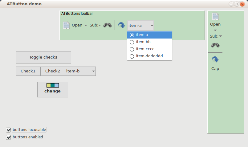
ATButtonsToolbar is component which creates ATButton's on it, this looks like toolbar.
It don't support creating toolbar in IDE design time. You need to call methods:
- AddButton: to add usual button, specify here ImageIndex, Caption (caption won't show), Hint, OnClick
- AddDropdown: to add button which looks like arrow-down, specify here PopupMenu, menu will show on click
- AddSep: to add button which is disabled and looks like "|" separator line
- UpdateControls: this makes items placement, you must call it after changes (also after ImageList size is changed)
- Use props ButtonCount and Buttons[i] to get ATButton's from component.
- Use Buttons[i].Free to delete buttons.
- To make vertical toolbar, set prop KindVertucal to True. In the vertical mode, don't add buttons of kind "dropdown arrow only", they won't paint ok, and it makes no sence.
Author: Alexey Torgashin
License
MPL 2.0 or LGPL.
Download
Homepage at github is https://github.com/Alexey-T/ATFlatControls
Requirements
Lazarus: 1.4.0.
Tested on: Win32 (Windows 7), Linux GTK2 / QT (Ubuntu 14.04), macOS (10.8).
