Difference between revisions of "Comparing TAChart with Delphi's TeeChart Standard"
From Lazarus wiki
Jump to navigationJump to searchm |
|||
| Line 18: | Line 18: | ||
* <code>AlignWithMargins</code>: VCL property, missing in LCL | * <code>AlignWithMargins</code>: VCL property, missing in LCL | ||
| − | * <code>AllowPanning</code>: | + | * <code>AllowPanning</code>: Turns on/off built-in panning support. Not available in TAChart, but effect can be achieved by linking a TChartToolset to the chart. |
| − | * <code>Anchors</code>: | + | * <code>Anchors</code>: Standard VCL/LCL property. |
| − | * <code>Animations</code>: | + | * <code>Animations</code>: Don't know, a click on the ellipsis button opens the series editor, maybe a feature of TeeChart Professional. Property missing in TAChart. |
* <code>AutoSize</code>: VCL/LCL property of some classes, don't know its effect on the chart, no entry in help file. Not used in TAChart. | * <code>AutoSize</code>: VCL/LCL property of some classes, don't know its effect on the chart, no entry in help file. Not used in TAChart. | ||
| − | * <code>AxisBehind: Boolean</code>, default <code>true</code>: | + | * <code>AxisBehind: Boolean</code>, default <code>true</code>: In 3D view, draws axis in the back wall, behind the series. If false, axes are drawn at the front wall, before the series. Property missing in TAChart, but effect can be achieved by TChartAxis.ZPosition. |
| − | * <code>AxisVisible: Boolean</code>, default <code>true</code>: | + | * <code>AxisVisible: Boolean</code>, default <code>true</code>: Turns on/off axis title, marks, ticks, and grid of all axes. The same as with TAChart. |
* <code>BackImage</code>: Allows to add a background image (see also other "BackImage*" properties). No image support in TAChart. | * <code>BackImage</code>: Allows to add a background image (see also other "BackImage*" properties). No image support in TAChart. | ||
| − | * <code>BackImageInside: Boolean</code>, default <code>false</code>: | + | * <code>BackImageInside: Boolean</code>, default <code>false</code>: If <code>true</code> the <code>BackImage</code> is drawn in the rectangle defined by the axes or frame, otherwise it is a background image of the entire chart. No image support in TAChart. |
| − | * <code>BackImageMode</code>: | + | * <code>BackImageMode</code>: Defines the way the image is drawn/repeated on the background, options (pbmStretch, pbmTile, pbmCenter, pbmCustom). No image support in TAChart. |
* <code>BackImageTransp: Boolean</code>, default <code>false</code>: If true the transparency is that of a TBitmap, i.e., the transparent color is taken from the left-bottom pixel of the image. If <code>BackImage</code> is an icon, <code>BackImageTransp</code> is <code>true</code> and cannot be changed. No image support in TAChart. | * <code>BackImageTransp: Boolean</code>, default <code>false</code>: If true the transparency is that of a TBitmap, i.e., the transparent color is taken from the left-bottom pixel of the image. If <code>BackImage</code> is an icon, <code>BackImageTransp</code> is <code>true</code> and cannot be changed. No image support in TAChart. | ||
| − | * <code>BackWall</code>: | + | * <code>BackWall</code>: See separate chapter on <code>TChartBackWall</code>. Missing in TAChart. |
* <code>BevelInner</code>, <code>BevelOuter</code>, <code>BevelWidth</code>: Bevel parameters like those of a <code>TPanel</code> -- TeeChart's TChart inherits from TCustomPanel. Missing in TAChart. | * <code>BevelInner</code>, <code>BevelOuter</code>, <code>BevelWidth</code>: Bevel parameters like those of a <code>TPanel</code> -- TeeChart's TChart inherits from TCustomPanel. Missing in TAChart. | ||
| − | * <code>Border</code>: | + | * <code>Border</code>: See separate chapter on <code>TChartHiddenPen</code>, a frame around the entire chart. Missing in TAChart. |
| − | * <code>BorderRound</code>: | + | * <code>BorderRound</code>: If grater than 0 the <code>Border</code> is drawn as a RoundRect with that radius. Missing in TAChart. |
* <code>BorderWidth</code>: Seems to have the same effect as the LCL's <code>BorderSpacing.Around</code> | * <code>BorderWidth</code>: Seems to have the same effect as the LCL's <code>BorderSpacing.Around</code> | ||
| Line 54: | Line 54: | ||
* <code>Chart3DPercent</code>: Ratio between chart dimensions and chart depth <code>Chart.View3D</code> is true. Similar to TAChart's property <code>Depth</code> of chart and some series. | * <code>Chart3DPercent</code>: Ratio between chart dimensions and chart depth <code>Chart.View3D</code> is true. Similar to TAChart's property <code>Depth</code> of chart and some series. | ||
| − | * <code>ClipPoints: boolean</code>, default <code>true</code>: | + | * <code>ClipPoints: boolean</code>, default <code>true</code>: Toggles the drawing of series points within chart boundaries, preventing other chart regions from being overwritten. Not available in TAChart, works as always <code>true</code>. |
* <code>Color</code>: Background color of entire chart, the same as with TAChart. | * <code>Color</code>: Background color of entire chart, the same as with TAChart. | ||
| Line 60: | Line 60: | ||
* <code>Constraints</code>: Standard VCL / LCL property. | * <code>Constraints</code>: Standard VCL / LCL property. | ||
| − | * <code>Cursor</code>: | + | * <code>Cursor</code>: Standard VCL / LCL property. |
* <code>CustomAxes</code>: List of axes, like with TAChart, but seems to be without the default axes. | * <code>CustomAxes</code>: List of axes, like with TAChart, but seems to be without the default axes. | ||
| Line 70: | Line 70: | ||
* <code>DepthTopAxis</code>: Characteristics of the left-top axis in 3D chart, see separate chapter on TChartDepthAxis. Missing in TAChart. | * <code>DepthTopAxis</code>: Characteristics of the left-top axis in 3D chart, see separate chapter on TChartDepthAxis. Missing in TAChart. | ||
| − | * <code>DockSite</code>: | + | * <code>DockSite</code>: Enables Docking, not supported by LCL and TAChart. |
* <code>DragCursor, DragMode</code>: Drag and Drop support, standard VCL/LCL property. | * <code>DragCursor, DragMode</code>: Drag and Drop support, standard VCL/LCL property. | ||
| − | * <code>Emboss</code>: | + | * <code>Emboss</code>: Some kind of upward shadow of entire chart background, not available. |
* <code>Enabled</code>: Not in help file, at least, turns off zooming and panning. | * <code>Enabled</code>: Not in help file, at least, turns off zooming and panning. | ||
| Line 82: | Line 82: | ||
* <code>Frame</code>: See separate chapter on TChartPen. Like in TAChart. | * <code>Frame</code>: See separate chapter on TChartPen. Like in TAChart. | ||
| − | * <code>Gradient</code>: See [[# | + | * <code>Gradient</code>: See [[#TTeeGradient|<code>TTeeGradient</code>]]. Draws a gradient behind the entire chart. No gradient support in TAChart. |
* <code>Height</code>: Standard VCL/LCL property. | * <code>Height</code>: Standard VCL/LCL property. | ||
| Line 100: | Line 100: | ||
* <code>Legend</code>: See [[#TeeChart's TChartLegend|<code>TChartLegend</code>]], describes legend parameters, like in TAChart. | * <code>Legend</code>: See [[#TeeChart's TChartLegend|<code>TChartLegend</code>]], describes legend parameters, like in TAChart. | ||
| − | * <code>LiveBindings</code>: | + | * <code>LiveBindings</code>: New VCL properties introduced in Delphi XE2. Not supported by LCL and TAChart. |
* <code>Locked</code>: ???, missing in TAChart | * <code>Locked</code>: ???, missing in TAChart | ||
| Line 106: | Line 106: | ||
* <code>MarginBottom, MarginLeft, MarginRight, MarginTop</code>: Margin between "Border" and Axis, corresponds to TAChart's <code>MarginExternal</code>. | * <code>MarginBottom, MarginLeft, MarginRight, MarginTop</code>: Margin between "Border" and Axis, corresponds to TAChart's <code>MarginExternal</code>. | ||
| − | * <code>MarginUnits | + | * <code>MarginUnits = (muPercent, muPixels)</code>: According to the help file: "When MarginUnits is muPercent, chart margins are calculated as percentage of total chart width and height. Percent margins are useful to obtain the same margin proportions, no matter the chart size." TAChart supports margin only in pixels. |
| − | * <code>Margins</code>: | + | * <code>Margins</code>: Standard VCL property, in combination with <code>AlignWithMargins</code>. Like LCL's <code>BorderSpacing</code>. |
| − | * <code>Monochrome</code>: | + | * <code>Monochrome</code>: If <code>true</code>, turns off colors and renders chart in grayscale. Not supported. |
| − | * <code>Name</code>: | + | * <code>Name</code>: Standard VCL/LCL property |
| − | * <code>Pages</code>: | + | * <code>Pages</code>: Accesses pages for a multi-page chart. Not supported. |
| − | * <code>Panning</code>: | + | * <code>Panning</code>: Properties for built-in panning support. Not available in TAChart, default panning by right mouse button, parameters, can be changed by means of chart tools. |
| − | * <code>ParentColor</code>: | + | * <code>ParentColor</code>: Standard VCL/LCL property. |
* <code>ParentCustomHint</code>: ???, missing in TAChart. | * <code>ParentCustomHint</code>: ???, missing in TAChart. | ||
| − | * <code>ParentShowHint</code>: | + | * <code>ParentShowHint</code>: Standard VCL/LCL property. |
| − | * <code>PopupMenu</code>: | + | * <code>PopupMenu</code>: Standard VCL/LCL property. |
| − | * <code>PrintProportional</code>: | + | * <code>PrintProportional</code>: No direct correspondence, in TAChart printing can be done as described [[TAChart_documentation#Printer_drawer|here]]. |
* <code>RightAxis</code>: See [[#TeeChart's TChartAxis|<code>TChartAxis</code>]]. | * <code>RightAxis</code>: See [[#TeeChart's TChartAxis|<code>TChartAxis</code>]]. | ||
| Line 132: | Line 132: | ||
* <code>RightWall</code>: See separate chapter on <code>TChartLeftWall</code>, describes left wall of 3D charts. Not available. | * <code>RightWall</code>: See separate chapter on <code>TChartLeftWall</code>, describes left wall of 3D charts. Not available. | ||
| − | * <code>ScrollMouseButton</code>: | + | * <code>ScrollMouseButton</code>: Sets the button that will trigger scrolling when pressed. TAChart does not have built-in scrolling support, effect can be achieved by chart tools. |
* <code>SeriesGroups</code>: According to the help file: "Chart Series can be grouped. Series groups can optionally be displayed at the chart editor. The main purpose of groups is to have an easy way to show or hide multiple series, that is, show or hide individual groups of series." Not available in TAChart. | * <code>SeriesGroups</code>: According to the help file: "Chart Series can be grouped. Series groups can optionally be displayed at the chart editor. The main purpose of groups is to have an easy way to show or hide multiple series, that is, show or hide individual groups of series." Not available in TAChart. | ||
| − | * <code>SeriesList</code>: | + | * <code>SeriesList</code>: Grayed out. In TAChart accessible as property <code>Series</code>. |
* <code>Shadow</code>: See separate chapter on TTeeShadow. No shadow support in TAChart. | * <code>Shadow</code>: See separate chapter on TTeeShadow. No shadow support in TAChart. | ||
| Line 146: | Line 146: | ||
* <code>SubTitle</code>: See [[#TeeChart's TChartTitle|<code>TChartTitle</code>]]. TeeChart allows for a second title, TAChart does not. | * <code>SubTitle</code>: See [[#TeeChart's TChartTitle|<code>TChartTitle</code>]]. TeeChart allows for a second title, TAChart does not. | ||
| − | * <code>TabOrder, TabStop, Tag</code>: | + | * <code>TabOrder, TabStop, Tag</code>: Standard VCL/LCL properties. |
[[file:TeeChart_object_explorer_3.png|right]] | [[file:TeeChart_object_explorer_3.png|right]] | ||
| Line 152: | Line 152: | ||
* <code>Title</code>: See [[#TeeChart's TChartTitle|<code>TChartTitle</code>]]. Similar to TAChart. | * <code>Title</code>: See [[#TeeChart's TChartTitle|<code>TChartTitle</code>]]. Similar to TAChart. | ||
| − | * <code>Tools</code>: | + | * <code>Tools</code>: Property is disabled in TeeChart Standard. Chart tools are an essential part of TAChart. |
| − | * <code>Top</code>: | + | * <code>Top</code>: Standard VCL/LCL property. |
* <code>TopAxis</code>: See [[#TeeChart's TChartAxis|<code>TChartAxis</code>]]. Parameters for second x axis above the chart. Property not available in TAChart, but can be accessed by <code>AxisList</code> in object tree. | * <code>TopAxis</code>: See [[#TeeChart's TChartAxis|<code>TChartAxis</code>]]. Parameters for second x axis above the chart. Property not available in TAChart, but can be accessed by <code>AxisList</code> in object tree. | ||
| Line 162: | Line 162: | ||
* <code>UseDockmanger</code>: Docking is not supported by Lazarus. | * <code>UseDockmanger</code>: Docking is not supported by Lazarus. | ||
| − | * <code>View3D, View3DOptions, View3DWalls</code>: | + | * <code>View3D, View3DOptions, View3DWalls</code>: Details on 3D charting. In TAChart, 3D effect can only be achieved by <code>Depth</code> properties of chart and some series. |
* <code>View3DOptions</code>: Not supported. | * <code>View3DOptions</code>: Not supported. | ||
| − | * <code>View3DWalls</code>: | + | * <code>View3DWalls</code>: Draw left and bottom "walls" to simulate 3D effect. Not available. |
| − | * <code>Visible</code>: | + | * <code>Visible</code>: Standard VCL/LCL property. |
| − | * <code>Width</code>: | + | * <code>Width</code>: Standard VCL/LCL property. |
| − | * <code>Zoom</code>: | + | * <code>Zoom</code>: Parameters to define the built-in zooming. Property not available in TAChart, but effect can be achieved by chart tools. |
==== TTeeGradient ==== | ==== TTeeGradient ==== | ||
| Line 186: | Line 186: | ||
* <code>EndColor, MidColor, StartColor</code>: The gradient fill depends three colors: <code>StartColor</code>, <code>MidColor</code> and <code>EndColor</code>. For a 2-color gradient, set <code>MidColor=clNone</code>. <code>MidColor</code> seems to be ignored for non-rectangular gradients. | * <code>EndColor, MidColor, StartColor</code>: The gradient fill depends three colors: <code>StartColor</code>, <code>MidColor</code> and <code>EndColor</code>. For a 2-color gradient, set <code>MidColor=clNone</code>. <code>MidColor</code> seems to be ignored for non-rectangular gradients. | ||
| − | * <code>RadialX, RadialY</code>: | + | * <code>RadialX, RadialY</code>: Offset in pixels to displace the gradient radial center. |
* <code>SubGradient</code>: Applies a secondary (superimposed) gradient to the gradient area. Has the same properties as <code>TTeeGradient</code> except for another <code>SubGradient</code>. | * <code>SubGradient</code>: Applies a secondary (superimposed) gradient to the gradient area. Has the same properties as <code>TTeeGradient</code> except for another <code>SubGradient</code>. | ||
| − | * <code>Visible</code>: | + | * <code>Visible</code>: Turns gradient on/off. |
=== Events === | === Events === | ||
| Line 204: | Line 204: | ||
=== Properties === | === Properties === | ||
[[file:TeeChartTitle_object_explorer.png|right]] | [[file:TeeChartTitle_object_explorer.png|right]] | ||
| − | * <code>AdjustFrame</code>: | + | * <code>AdjustFrame</code>: Controls if chart title and foot frames will be resized to full chart dimensions or to the title text width. Not available. |
| − | * <code>Alignment</code>: | + | * <code>Alignment</code>: The same as with TAChart. |
* <code>Bevel, BevelWidth</code>: Defines a bevel around the Title. Not available. | * <code>Bevel, BevelWidth</code>: Defines a bevel around the Title. Not available. | ||
| Line 214: | Line 214: | ||
* <code>Color</code>: Background color of the title. In TAChart, use <code>Brush.Color</code>. | * <code>Color</code>: Background color of the title. In TAChart, use <code>Brush.Color</code>. | ||
| − | * <code>CustomPosition: boolean</code>: | + | * <code>CustomPosition: boolean</code>: If <code>true</code>, title can be positioned by <code>Left</code> and <code>Top</code> properties. Not supported. |
| − | * <code>Emboss</code>: | + | * <code>Emboss</code>: Some kind of upward-directed shadow. Not supported. |
| − | * <code>Font</code>: | + | * <code>Font</code>: Similar to TAChart |
| − | * <code>Frame: TChartPen</code>: | + | * <code>Frame: TChartPen</code>: A frame around the title with sub-properties <code>Color</code>, <code>EndStyle</code>, <code>Mode</code>, <code>SmallDots</code>, <code>SmallSpace</code>, <code>Style</code>, <code>Visible</code>, <code>Width</code>. Very similar to TAChart. |
| − | * <code>Gradient</code>: | + | * <code>Gradient</code>: Allows to fill the title background with a gradient, see [[#TTeeGradient|<code>TTeeGradient</code>]]. No gradient support in TAChart. |
* <code>Left, Top</code>: Distance of title from chart edge, used if <code>CustomPosition=true</code>. Not available. | * <code>Left, Top</code>: Distance of title from chart edge, used if <code>CustomPosition=true</code>. Not available. | ||
| Line 232: | Line 232: | ||
* <code>ShapeStyle = fosEllipse, fosRectangle, fosRoundRectangle</code>: Title shape, like TAChart's <code>Shape</code> which has more options. | * <code>ShapeStyle = fosEllipse, fosRectangle, fosRoundRectangle</code>: Title shape, like TAChart's <code>Shape</code> which has more options. | ||
| − | * <code>Text</code>: | + | * <code>Text</code>: Like TAChart |
* <code>TextFormat = (ttfNormal, ttfHTML)</code>: Allows HTML formatting in the title. Not available in TAChart. | * <code>TextFormat = (ttfNormal, ttfHTML)</code>: Allows HTML formatting in the title. Not available in TAChart. | ||
| − | * <code>Transparency = 0..100</code>: | + | * <code>Transparency = 0..100</code>: Defines how much of the background is visible through the title (as percentage). Not available in TAChart. |
| − | * <code>Transparent: boolean</code>: | + | * <code>Transparent: boolean</code>: If true only the text is visible, all decorating elements are turned off. Missing in TAChart. |
| − | * <code>Visible</code>: | + | * <code>Visible</code>: Show/hides title, like in TAChart. |
== TeeChart's TChartLegend == | == TeeChart's TChartLegend == | ||
| Line 257: | Line 257: | ||
* <code>Brush, Color</code>: Defines parameters how to fill the background of the legend. TAChart has a <code>BackgroundBrush</code> property which behaves slightly different. The background color, e.g., is set by <code>BackgroundBrush.Color</code>, while TeeChart uses the property <code>Color</code>. | * <code>Brush, Color</code>: Defines parameters how to fill the background of the legend. TAChart has a <code>BackgroundBrush</code> property which behaves slightly different. The background color, e.g., is set by <code>BackgroundBrush.Color</code>, while TeeChart uses the property <code>Color</code>. | ||
| − | * <code>Checkboxes</code>: | + | * <code>Checkboxes</code>: Enables/disabled display of checkboxes or radiobuttons for each legend item. Not available in TAChart, but <code>TChartListbox</code> can be a replacement. |
| − | * <code>CheckboxesStyle | + | * <code>CheckboxesStyle = (cbsCheck, cbsRadio)</code>: Not available in TAChart, but the legend can be replaced by a <code>TChartListbox</code> where you can select the property <code>CheckStyle</code>. |
| − | * <code>ColorWidth</code>: | + | * <code>ColorWidth</code>: Defines percentage of width of color rectangle associated with each legend item. Like <code>SymbolWidth</code> in TAChart which is in pixels, though. |
| − | * <code>CurrentPage: Boolean</code>: | + | * <code>CurrentPage: Boolean</code>: When chart is divided into several pages this property, if <code>true</code>, displays only the items for the current page. No page support in TAChart. |
* <code>CustomPosition, Left, LeftPercent, Top, TopPercent, PositionUnits</code>: If <code>CustomPosition = true</code> legend positioning can be fine-tuned by <code>Left</code> and <code>Top</code> properties (if <code>PositionUnits = muPixels</code>), or by <code>LeftPercent</code> and <code>TopPercent</code> (if <code>PositionUnits = muPercent</code>). Not available. | * <code>CustomPosition, Left, LeftPercent, Top, TopPercent, PositionUnits</code>: If <code>CustomPosition = true</code> legend positioning can be fine-tuned by <code>Left</code> and <code>Top</code> properties (if <code>PositionUnits = muPixels</code>), or by <code>LeftPercent</code> and <code>TopPercent</code> (if <code>PositionUnits = muPercent</code>). Not available. | ||
| − | * <code>DividingLines</code>: | + | * <code>DividingLines</code>: Sets the pen attributes of optional lines that divide individual legend items. Not available. |
* <code>Emboss: TTeeEmboss</code>: Parameters for some kind of upward shadow. Absent in TAChart. | * <code>Emboss: TTeeEmboss</code>: Parameters for some kind of upward shadow. Absent in TAChart. | ||
| Line 275: | Line 275: | ||
* <code>Font</code>: Similar to TAChart. | * <code>Font</code>: Similar to TAChart. | ||
| − | * <code>FontSeriesColor: Boolean</code>: | + | * <code>FontSeriesColor: Boolean</code>: If <code>true</code> the legend item text is drawn in the same color as the series. Not directly available in TAChart, but effect can be achieved by handling the <code>OnDraw</code> event of the series.Legend. |
*<code>Frame</code>: Similar to TAChart. | *<code>Frame</code>: Similar to TAChart. | ||
| − | *<code>Gradient</code>: No background gradient support in TAChart. | + | *<code>Gradient</code>: See [[#TTeeGradient|<code>TTeeGradient</code>]]. No background gradient support in TAChart. |
| − | *<code>HorizMargin, VertMargin</code>: | + | *<code>HorizMargin, VertMargin</code>: Specifies the number of screen pixels between legend and chart rectangle. In TAChart, use properties <code>MarginX</code> and/or <code>MarginY</code>. |
*<code>Inverted</code>: Legend items are drawn in the order first to last, or last to first. Not available in TAChart, but the order of series in the legend is defined by the series' property <code>Legend.Order</code>. | *<code>Inverted</code>: Legend items are drawn in the order first to last, or last to first. Not available in TAChart, but the order of series in the legend is defined by the series' property <code>Legend.Order</code>. | ||
| Line 289: | Line 289: | ||
*<code>MaxNumRows</code>: 0 means "all rows". Not available in TAChart, but series may be excluded from the legend by setting their <code>Legend.Visible</code> to <code>false</code>. | *<code>MaxNumRows</code>: 0 means "all rows". Not available in TAChart, but series may be excluded from the legend by setting their <code>Legend.Visible</code> to <code>false</code>. | ||
| − | * <code>Picture</code>: | + | * <code>Picture</code>: Background picture of the legend. No picture support in TAChart. |
| − | * <code>ResizeChart</code>: | + | * <code>ResizeChart</code>: Determines whether or not the legend reduces the chart rectangle to prevent overlap between legend and chart rectangles. In TAChart, use <code>UseSidebar</code>. |
| − | * <code>RoundSize: Integer</code>: | + | * <code>RoundSize: Integer</code>: Corner radius for rounded rectangle frame (see property <code>ShapeStyle</code>). Not available in TAChart. |
| − | * <code>Shadow</code>: | + | * <code>Shadow</code>: No shadow support in TAChart |
| − | * <code>ShapeStyle = (fosRectangle, fosRoundRectangle, fosEllipse)</code>: | + | * <code>ShapeStyle = (fosRectangle, fosRoundRectangle, fosEllipse)</code>: Shape of the legend. TAChart supports only rectangular shapes for the legend. |
* <code>Symbol</code>: Parameters that define how the series symbol is displayed in the legend (<code>Continuous, DefaultPen, Gradient, Pen, Position, Shadow, Squared, Visible, Width, WidthUnits</code>). In TAChart, use <code>SymbolFrame</code> and <code>SymbolWidth</code> for some of these properties. | * <code>Symbol</code>: Parameters that define how the series symbol is displayed in the legend (<code>Continuous, DefaultPen, Gradient, Pen, Position, Shadow, Squared, Visible, Width, WidthUnits</code>). In TAChart, use <code>SymbolFrame</code> and <code>SymbolWidth</code> for some of these properties. | ||
| Line 305: | Line 305: | ||
* <code>TextSymbolGap</code>: Like <code>SymbolWidth</code> of TAChart. | * <code>TextSymbolGap</code>: Like <code>SymbolWidth</code> of TAChart. | ||
| − | * <code>Title</code>: | + | * <code>Title</code>: Text box to show at legend's top. In TAChart, effect can be achieved by means of <code>Legend.GroupTitles</code>. |
| − | * <code>TopPos</code>: | + | * <code>TopPos</code>: Specifies the Legend's top (or left) position as a percentage of the total chart height (or width). When the <code>Alignment</code> property is <code>laLeft</code> or <code>laRight</code> (vertical legend), the <code>TopPos</code> property increments the top legend position by this percentage of the total chart height. For <code>laTop</code> or <code>laBottom</code> legend alignments (horizontal legend), it increments the legend's left position. Not available in TAChart. |
| − | * <code>Transparency</code>: | + | * <code>Transparency</code>: Sets percent transparency of the legend. Not available. |
| − | * <code>Transparent</code>: | + | * <code>Transparent</code>: Turns on/off decorating elements liks frame, shadow etc. Property not supported in TAChart, but effect can be achieved by handling elements individually. |
| − | * <code>Visible</code>: | + | * <code>Visible</code>: The same as with TAChart. |
== TeeChart's TChartAxis == | == TeeChart's TChartAxis == | ||
| Line 322: | Line 322: | ||
=== Properties === | === Properties === | ||
[[file:TeeChart_TChartAxis_properties.png|right]] | [[file:TeeChart_TChartAxis_properties.png|right]] | ||
| − | * <code>Automatic, AutomaticMaximum, AutomaticMinimum</code>: | + | * <code>Automatic, AutomaticMaximum, AutomaticMinimum</code>: Automatic range finding, or if off, use <code>Maximum</code> and/or <code>Minimum</code> for axis ends. In TAChart, use <code>Range</code>. |
* <code>Axis: TChartAxisPen</code>: Defines how the axis line is drawn. In TAChart, use <code>AxisPen</code>. | * <code>Axis: TChartAxisPen</code>: Defines how the axis line is drawn. In TAChart, use <code>AxisPen</code>. | ||
| − | * <code>AxisValuesFormat</code>: | + | * <code>AxisValuesFormat</code>: Format mask for <code>FormatFloat</code> that defines the format of the axis labels (default: <code>#,##0.###</code>). In TAChart, use <code>Marks.Format</code>, default: <code>%0:.9g</code>. |
* <code>DateTimeFormat</code>: Defines how date/time values are formatted. No direct equivalent in TAChart. Effect can be created by TDateTimeChartSource or TListChartSource. | * <code>DateTimeFormat</code>: Defines how date/time values are formatted. No direct equivalent in TAChart. Effect can be created by TDateTimeChartSource or TListChartSource. | ||
| − | * <code>EndPosition, StartPosition</code>: | + | * <code>EndPosition, StartPosition</code>: Defines the percentage position of chart width or height where the axis begins and ends. Left and Top are 0,0 positions. No 1:1 equivalent in TAChart, but effect can be achieved by Range. |
* <code>ExactDateTime: boolean</code>: Useful when placing date/time ticks e.g. at the first of each month such that the tick distance is the number of days per month. Missing in TAChart. Can be achieved with some coding using a TListChartSource. | * <code>ExactDateTime: boolean</code>: Useful when placing date/time ticks e.g. at the first of each month such that the tick distance is the number of days per month. Missing in TAChart. Can be achieved with some coding using a TListChartSource. | ||
| Line 344: | Line 344: | ||
* <code>Inverted</code>: If <code>true></code> the axis runs into reverse direction. Same as with TAChart. | * <code>Inverted</code>: If <code>true></code> the axis runs into reverse direction. Same as with TAChart. | ||
| − | * <code>Labels</code>: | + | * <code>Labels</code>: Turns axis labels on and off. In TAChart: <code>Marks.Visible</code> |
| − | * <code>LabelsAlign</code>: | + | * <code>LabelsAlign</code>: If <code>alDefault</code> labels of vertical axes are aligned towards the axis line (left axis: right-aligned), if <code>alOpposite</code> they are aligned away from the axis line (left axis: left-aligned). Not supported. |
| − | * <code>LabelsAlternate</code>: | + | * <code>LabelsAlternate</code>: If true labels for horizontal are offset vertically, one near axis, the next one a line deeper. Not available. |
* <code>LabelsAngle</code>: Rotation angle of labels in degrees. Like TAChart's <code>Marks.LabelFont.Orientation</code> which is in tenths of degrees, though. | * <code>LabelsAngle</code>: Rotation angle of labels in degrees. Like TAChart's <code>Marks.LabelFont.Orientation</code> which is in tenths of degrees, though. | ||
| Line 358: | Line 358: | ||
* <code>LabelsFont</code>: Font of labels, like TAChart's <code>Mark.LabelFont</code> which has less subproperties, though. | * <code>LabelsFont</code>: Font of labels, like TAChart's <code>Mark.LabelFont</code> which has less subproperties, though. | ||
| − | * <code>LabelsMultiLine</code>: | + | * <code>LabelsMultiLine</code>: Allows multi-line labels. No direct correspondence in TAChart, but effect can be achieved by event <code>OnMarkToText</code>. |
| − | * <code>LabelsOnAxis</code>: | + | * <code>LabelsOnAxis</code>: Controls if labels at axis minimum and maximum positions will be shown or not. Not available in TAChart, effect can be partially achieved using <code>Marks.Range</code> property. |
| − | * <code>LabelsSeparation</code>: | + | * <code>LabelsSeparation</code>: Specifies the percent amount of minimum distance between labels. Zero value causes overlapping labels. Not directly available in TAChart, but effect can be partially achieved by <code>Intervals</code> and <code>OverlapPolicy</code> settings. |
* <code>LabelsSize</code>: Size occupied by labels, default 0 means automatic calculation. If not correct, axis title may overlap with labels. No equivalent in TAChart, always automatic. | * <code>LabelsSize</code>: Size occupied by labels, default 0 means automatic calculation. If not correct, axis title may overlap with labels. No equivalent in TAChart, always automatic. | ||
| − | * <code>LabelsStyle | + | * <code>LabelsStyle = (<code>talAuto, talNone, talPointValue, talText, talValue</code>): Like TAChart's <code>Marks.Style</code>. No correspondence for <code>talAuto</code>, though, which tries to guess the value displayed from the type of axis, e.g. if series has XLabels, then <code>talText</code> will be used. |
* <code>Logarithmic</code>: Enables logarithmic axis scaling. In TAChart no direct correspondence, but effect can be achieved by means of AxisTransformations and <code>Axis.Intervals</code>. | * <code>Logarithmic</code>: Enables logarithmic axis scaling. In TAChart no direct correspondence, but effect can be achieved by means of AxisTransformations and <code>Axis.Intervals</code>. | ||
| Line 372: | Line 372: | ||
* <code>LogarithmicBase</code>: Base for logarithmic scaling. In TAChart, property is found in the transformation <code>TLogarithmAxisTransform</code> needed to achieve logarithmic scaling. | * <code>LogarithmicBase</code>: Base for logarithmic scaling. In TAChart, property is found in the transformation <code>TLogarithmAxisTransform</code> needed to achieve logarithmic scaling. | ||
| − | * <code>MaximumOffset, MinimumOffset</code>: | + | * <code>MaximumOffset, MinimumOffset</code>: Pixels that will be left as a margin at axis maximum or minimum positions. In TAChart: <code>TChart.Margins.Right</code> or <code>Margins.Left</code>, <code>MarginsForMarks = true</code> for automatic calculation. |
| − | * <code>MaximumRound, MinimumRound</code>: | + | * <code>MaximumRound, MinimumRound</code>: Rounds axis maximum or minimum to the next integer. Not available in TAChart. |
| − | * <code>MinorGrid</code>: | + | * <code>MinorGrid</code>: Parameters to define minor grid. Use property <code>Minors[n].Grid</code>. |
| − | * <code>MinorTickCount</code>: | + | * <code>MinorTickCount</code>: Number of minor ticks between two major ticks. Use <code>Intervals</code> property of <code>Minors[n]</code>. |
| − | * <code>MinorTickLength</code>: | + | * <code>MinorTickLength</code>: Length of minor ticks. In TAChart, the property is <code>Axis.Minors[n].TickLength</code>; there is also an TickInnerLength which TeeChart does not have. |
| − | * <code>MinorTicks</code>: | + | * <code>MinorTicks</code>: Parameter to define minor ticks. Use property <code>Minors[n]</code>. |
| − | * <code>OtherSide</code>: | + | * <code>OtherSide</code>: If <code>true</code> axis is drawn on the opposite side of the chart. In TAChart, change the <code>Alignment</code> of the axis correspondingly. |
* <code>PartnerAxis</code>: ??? | * <code>PartnerAxis</code>: ??? | ||
| Line 398: | Line 398: | ||
* <code>Ticks, TicksInner</code>: Determines drawing of the outer and inner ticks (Color, EndStyle, Mode, Style, Visible, Width, etc). In TAChart only <code>TickColor</code>. | * <code>Ticks, TicksInner</code>: Determines drawing of the outer and inner ticks (Color, EndStyle, Mode, Style, Visible, Width, etc). In TAChart only <code>TickColor</code>. | ||
| − | * <code>Title</code>: | + | * <code>Title</code>: Defines the axis title - see [[#TChartAxisTitle_properties|<code>TChartAxisTitle</code>]]. TAChart has the same property but with less sub-properties; the main difference is that TAChart's <code>Visible</code> defaults to <code>false</code>. |
* <code>TitleSize</code>: Distance between title and chart border (?). 0 --> automatic determination. Use <code>Margin</code> property in TAChart. | * <code>TitleSize</code>: Distance between title and chart border (?). 0 --> automatic determination. Use <code>Margin</code> property in TAChart. | ||
| − | * <code>UsePartnerAxis</code>: | + | * <code>UsePartnerAxis</code>: No effect in TeeChart Standard. No equivalent in TAChart. |
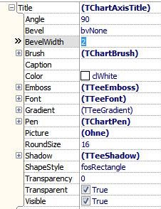
[[file:TeeChart_TChartAxisTitle_properties.png|right]] | [[file:TeeChart_TChartAxisTitle_properties.png|right]] | ||
| Line 414: | Line 414: | ||
Here is a description of properties that have not yet been explained in [[#TChartTitle|<code>TChartTitle</code>]]. | Here is a description of properties that have not yet been explained in [[#TChartTitle|<code>TChartTitle</code>]]. | ||
| − | * <code>Angle</code>: | + | * <code>Angle</code>: Rotation angle of title, in degrees. In TAChart, use <code>Title.LabelFont.Orientation</code> which is in tenths of degrees. |
| − | * <code>Caption</code>: | + | * <code>Caption</code>: Text to be displayed as axis title. Same as in TAChart. |
| − | * <code>Pen</code>: | + | * <code>Pen</code>: Defines parameters that draw the frame around the title. In TAChart, use <code>Frame</code>. |
| − | * <code>RoundSize</code>: | + | * <code>RoundSize</code>: Corner radius of rounded rectangle if <code>ShapeStyle = fosRoundRectangle</code>. Not available. |
| − | * <code>Visible</code>: | + | * <code>Visible</code>: Toggles the axis title. Same as in TAChart where the title is off by default. |
== TeeChart's TLineSeries == | == TeeChart's TLineSeries == | ||
| Line 430: | Line 430: | ||
* <code>Active</code>: Shows/hides series, like in TAChart. | * <code>Active</code>: Shows/hides series, like in TAChart. | ||
| − | * <code>Brush</code>: | + | * <code>Brush</code>: Used in 3d view to paint the band of the line series. Not available in TAChart. |
| − | * <code>ClickableLine</code>: | + | * <code>ClickableLine</code>: Determines if series accepts mouse clicks over the line segment drawn between points. Not available. |
| − | * <code>ColorEachLine</code>: | + | * <code>ColorEachLine</code>: If <code>ColorEachPoint</code> is <code>true</code>, determines if the connecting lines of a lineseries will also be displayed using a different color for each line segment. Not available. |
| − | * <code>ColorEachPoint</code>: | + | * <code>ColorEachPoint</code>: If <code>false</code>, all points will be drawn using the <code>SeriesColor</code> property. If <code>true</code>, each series point will be colored with its corresponding point color. In TAChart, assign colors to each <code>ChartDataItem</code> by calling <code>ListSource.SetColor</code>. |
| − | * <code>ColorSource</code>: | + | * <code>ColorSource</code>: Used only when connecting a series to a database dataset or datasource. Must be a valid database field name. Not supported. |
| − | * <code>Cursor</code>: | + | * <code>Cursor</code>: Shown when the mouse moves sufficiently close to the series. Not suppored in TAChart. |
| − | * <code>Dark3D</code>: | + | * <code>Dark3D</code>: In 3d view, draws band of lineseries darker and brighter depending on orientation to light source. Not supported. |
* <code>DataSource</code>: A TChartSeries can be optionally connected to a "point data provider" (or DataSource) which may be another series, TDataset derived class, or "TTeeSeriesSource". Concept similar to TAChart's chart sources. | * <code>DataSource</code>: A TChartSeries can be optionally connected to a "point data provider" (or DataSource) which may be another series, TDataset derived class, or "TTeeSeriesSource". Concept similar to TAChart's chart sources. | ||
| − | * <code>Depth</code>: | + | * <code>Depth</code>: In 3d view, depth of the band drawn. Like in TAChart. |
| − | * <code>Emboss</code>: | + | * <code>Emboss</code>: Upward-directed shadow. Not supported in TAChart. |
| − | * <code>Gradient</code>: | + | * <code>Gradient</code>: Gradient drawn across depth of the 3d band, see [[#TTeeGradient|<code>TTeeGradient</code>]]. Not supported. |
| − | * <code>HorizAxis = (aTopAxis, aBottomAxis, aBothHorizAxis, aCustomHorizAxis)</code>: | + | * <code>HorizAxis = (aTopAxis, aBottomAxis, aBothHorizAxis, aCustomHorizAxis)</code>: Identifies which horizontal axis is used. Similar to TAChart's <code>AxisIndexX</code>. |
| − | * <code>InvertedStairs</code>: | + | * <code>InvertedStairs</code>: Alter the direction of the stairs. In TAChart, like <code>LineType = ltStepYX</code>. |
| − | * <code>LegendTitle</code>: | + | * <code>LegendTitle</code>: Title to be used in legend, different from default <code>Title</code>. Not available in TAChart which normally uses <code>Title</code> only, but legend text can be altered from <code>Title</code> by event <code>Legend.OnCreate</code>. |
| − | * <code>LineBrush</code>: | + | * <code>LineBrush</code>: Defines the brush style used to fill lineseries band in 3d view. Identical to <code>Brush.Style</code>. Not supported in TAChart. |
| − | * <code>LineHeight</code>: | + | * <code>LineHeight</code>: Thickness of the band drawn in 3d view. Not supported. |
| − | * <code>LinePen</code>: | + | * <code>LinePen</code>: Pen parameters used to draw the line series in 2d view. Like TAChart. |
| − | * <code>Marks</code>: | + | * <code>Marks</code>: Defines all necessary properties to draw a mark near to each series point, see [[#TSeriesMarks|<code>TSeriesMarks</code>]]. Similar to TAChart (which has less options). |
| − | * <code>Name</code>: | + | * <code>Name</code>: Standard VCL/LCL property |
| − | * <code>Outline</code>: | + | * <code>Outline</code>: Determines an additional pen used to display a "border" or "outline" around a lineseries. Not available. |
* <code>ParentChart</code>: Chart to which the series belongs. In TAChart, readonly and public. | * <code>ParentChart</code>: Chart to which the series belongs. In TAChart, readonly and public. | ||
| − | * <code>PercentFormat</code>: | + | * <code>PercentFormat</code>: Standard formatting string specifier used to draw the series marks in percent style. In TAChart, use <code>Marks.Format</code>. |
| − | * <code>Pointer</code>: | + | * <code>Pointer</code>: Parameters to draw data points, see [[#TSeriesPointer|<code>TSeriesPointer</code>]]. Similar to TAChart which has less options. |
| − | * <code>SeriesColor</code>: | + | * <code>SeriesColor</code>: Color of the series, like in TAChart. |
| − | * <code>Shadow</code>: | + | * <code>Shadow</code>: No shadow support in TAChart. |
| − | * <code>ShowInEditor</code>: | + | * <code>ShowInEditor</code>: Shows/hides series in chart editor. Not available. |
| − | * <code>ShowInLegend</code>: | + | * <code>ShowInLegend</code>: Shows/hides series in legend. Use <code>Legend.Visible</code> in TAChart. |
| − | * <code>Stacked = (cssNone, cssOverlap, cssStack, cssStack100)</code>: | + | * <code>Stacked = (cssNone, cssOverlap, cssStack, cssStack100)</code>: Stacking of series. In TAChart, use multi-valued source. |
| − | * <code>Stairs: boolean</code>: | + | * <code>Stairs: boolean</code>: Connects data paints by line segments (<code>false</code>) or stairs (<code>true</code>). In TAChart is is controlled by <code>LineType=ltFromPrevious</code>, or <code>LineType = ltStepXY or ltStepYX</code>, respectively. |
| − | * <code>Tag</code>: | + | * <code>Tag</code>: Standard VCL/LCL property |
| − | * <code>Title</code>: | + | * <code>Title</code>: Text to identify the series in the legend. Same with TAChart. |
| − | * <code>Transparency</code>: | + | * <code>Transparency</code>: Percent transparency of the series. The same in TAChart, but values are between 0 and 255. |
* <code>TreatNulls</code>: Not available, but TAChart works like <code>tnSkip</code>: | * <code>TreatNulls</code>: Not available, but TAChart works like <code>tnSkip</code>: | ||
| − | **<code>tnDontPaint</code>: | + | **<code>tnDontPaint</code>: Line from non-null to null point is displayed, line from null to non-null is not displayed |
| − | **<code>tnSkip</code>: | + | **<code>tnSkip</code>: Lines between a non-null point and the null point and the next non-null point are not displayed. |
| − | **<code>tnIgnore</code>: | + | **<code>tnIgnore</code>: Treats all points as non-nulls. |
| − | * <code>ValueFormat</code>: | + | * <code>ValueFormat</code>: Standard formatting string specifier used to draw the series Marks. |
| − | * <code>VertAxis = (aLeftAxis, aRightAxis, aBothVertAxis, aCustomVertAxis)</code>: | + | * <code>VertAxis = (aLeftAxis, aRightAxis, aBothVertAxis, aCustomVertAxis)</code>: Identifies which vertical axis is used. Similar to TAChart's <code>AxisIndexY</code>. |
| − | * <code>XLabelsSource</code>: | + | * <code>XLabelsSource</code>: Name of a DataSet field that contains the point labels. In TAChart, a DBChartSource is needed. |
| − | * <code>XValues, YValues</code>: | + | * <code>XValues, YValues</code>: Provides information on storage of x and y values. In TAChart, use <code>Source</code> property for this purpose. |
==== TChartValueList ==== | ==== TChartValueList ==== | ||
| Line 521: | Line 521: | ||
==== TSeriesMarks ==== | ==== TSeriesMarks ==== | ||
[[file:TeeChart_TSeriesMarks_properties.png|right]] | [[file:TeeChart_TSeriesMarks_properties.png|right]] | ||
| − | * <code>Angle</code>: | + | * <code>Angle</code>: Rotation angle of marks, in degrees. In TAChart, use <code>Marks.LabelFont.Orientation</code> (which is in tenths of degrees). |
| − | * <code>Arrow</code>: | + | * <code>Arrow</code>: Parameters for the connecting line between mark and data point. Property name is misleading since an arrow head is not drawn by default (only after setting <code>Callout.ArrowHead</code> to a value different from <code>ahNone</code>). This property is called <code>LinkPen</code>, parameters for an arrow head are available under <code>Arrow</code>. |
| − | * <code>ArrowLength</code>: | + | * <code>ArrowLength</code>: Length of the connecting line between mark and data point. Use <code>Distance</code> in TAChart. |
* <code>BackColor</code>: Background color of the mark. In TAChart, use <code>LabelBrush.Color</code>. | * <code>BackColor</code>: Background color of the mark. In TAChart, use <code>LabelBrush.Color</code>. | ||
| − | * <code>Bevel, BevelWidth</code>: | + | * <code>Bevel, BevelWidth</code>: Draws a bevel around the mark (like TPanel). Not available. |
* <code>Brush</code>: Parameters to draw the background of the mark. In TAChart, use <code>LabelBrush</code> which has less options, though. | * <code>Brush</code>: Parameters to draw the background of the mark. In TAChart, use <code>LabelBrush</code> which has less options, though. | ||
| Line 535: | Line 535: | ||
* <code>CallOut</code>: Parameters to refine the connection line between mark and data point; you can also set the arrow head here. In TAChart, callout-type of connection can be defined by CallOutAngle which is in tenths of degrees; the arrow head is set by property <code>Arrow</code>. | * <code>CallOut</code>: Parameters to refine the connection line between mark and data point; you can also set the arrow head here. In TAChart, callout-type of connection can be defined by CallOutAngle which is in tenths of degrees; the arrow head is set by property <code>Arrow</code>. | ||
| − | * <code>Clip</code>: | + | * <code>Clip</code>: Clips mark labels at the edge of the chart areas. Called <code>Clipped</code> in TAChart. |
* <code>Color</code>: Seems to be the same as <code>BackColor</code>. <code>LinkBrush.Color</code> in TAChart. | * <code>Color</code>: Seems to be the same as <code>BackColor</code>. <code>LinkBrush.Color</code> in TAChart. | ||
| Line 541: | Line 541: | ||
* <code>DrawEvery: Integer</code>: Allows to skip a number of marks to avoid overlap. Not available. | * <code>DrawEvery: Integer</code>: Allows to skip a number of marks to avoid overlap. Not available. | ||
| − | * <code>Emboss</code>: | + | * <code>Emboss</code>: Upward-directed shadow. Not supported. |
| − | * <code>Font</code>: | + | * <code>Font</code>: Font of the marks text. In TAChart <code>LabelFont</code>. |
| − | * <code>Frame</code>: | + | * <code>Frame</code>: Parameters for drawing the frame around the mark. The same as with TAChart. |
| − | * <code>Gradient</code>: No gradient support in TAChart. | + | * <code>Gradient</code>: See [[#TTeeGradient|<code>TTeeGradient</code>]]. No gradient support in TAChart. |
* <code>Margins</code>: Distance between text and frame. The same as with TAChart. | * <code>Margins</code>: Distance between text and frame. The same as with TAChart. | ||
| − | * <code>MultiLine</code>: | + | * <code>MultiLine</code>: Enable/disable multilined marks. Not available in TAChart, but works like <code>true</true> if the mark format mask contains <code>LineEnding</code>. |
| − | * <code>Picture</code>: | + | * <code>Picture</code>: No support for background picture in TAChart. |
| − | * <code>Shadow</code>: | + | * <code>Shadow</code>: No shadow support in TAChart. |
* <code>ShapeStyle = (fosEllipse, fosRectangle, fosRoundRectangle)</code>: Like TAChart's <code>Shape</code> which has more options. | * <code>ShapeStyle = (fosEllipse, fosRectangle, fosRoundRectangle)</code>: Like TAChart's <code>Shape</code> which has more options. | ||
| − | * <code>Style = (smsLabel, smsLabelPercent, smsLabelPercentTotal, smsLabelValue, smsLegend, smsPercent, smsPercentRelative, smsPercentTotal, smsPointIndex, smsSeriesTitle, smsValue, smsXValue, smsXY)</code>: | + | * <code>Style = (smsLabel, smsLabelPercent, smsLabelPercentTotal, smsLabelValue, smsLegend, smsPercent, smsPercentRelative, smsPercentTotal, smsPointIndex, smsSeriesTitle, smsValue, smsXValue, smsXY)</code>: Like TAChart's <code>Style</code> with slightly different options. |
* <code>Symbol</code>: Adds the series symbol to the mark. Not available. | * <code>Symbol</code>: Adds the series symbol to the mark. Not available. | ||
| Line 565: | Line 565: | ||
* <code>TextAlign</code>: Alignment of text within frame rectangle. Not available. | * <code>TextAlign</code>: Alignment of text within frame rectangle. Not available. | ||
| − | * <code>Transparency</code>: | + | * <code>Transparency</code>: Percentage of transparency to see the background underneath the marks. Not available. |
| − | * <code>Transparent</code>: | + | * <code>Transparent</code>: Toggles visual enhancements like frame, shadow, emboss. Not available. |
| − | * <code>Visible</code>: | + | * <code>Visible</code>: Turns marks on/off. The same as in TAChart. |
==== TSeriesPointer ==== | ==== TSeriesPointer ==== | ||
| Line 576: | Line 576: | ||
* <code>Brush</code>: Parameters, how the interior of the symbol is filled. Like in TAChart. | * <code>Brush</code>: Parameters, how the interior of the symbol is filled. Like in TAChart. | ||
| − | * <code>Dark3D</code>: | + | * <code>Dark3D</code>: Shades faces of the extruded shape (if <code>Draw3D=true</code>) as if it were illuminated by a light source. Not available. |
| − | * <code>Depth, Draw3D</code>: | + | * <code>Depth, Draw3D</code>: In 3d view, allows to extrude symbols into depth (as specified by <code>Depth</code>); only available of <code>Style = psRectangle</code>. Not available in TAChart. |
| − | * <code>Emboss</code>: Upward directed shadow, not supported. | + | * <code>Emboss</code>: Upward-directed shadow, not supported. |
| − | * <code>Gradient</code>: No gradient support in TAChart | + | * <code>Gradient</code>: See [[#TTeeGradient|<code>TTeeGradient</code>]]. No gradient support in TAChart |
* <code>HorizSize, VertSize</code>: Size of the data symbol, like in TAChart. | * <code>HorizSize, VertSize</code>: Size of the data symbol, like in TAChart. | ||
| − | * <code>InflateMargins</code>: | + | * <code>InflateMargins</code>: Automatically increases the extent of the chart such that the symbols at the edge are not clipped. Not available in TAChart, but can be achieved manually by increasing the chart's <code>Margins</code>. |
* <code>Pen</code>: Parameters used to draw the outline of the symbol. Like in TAChart. | * <code>Pen</code>: Parameters used to draw the outline of the symbol. Like in TAChart. | ||
| Line 594: | Line 594: | ||
* <code>Style = (psRectangle, psCircle, psTriangle, psDownTriangle, psCross, psDiagCross, psStar, psDiamond, psSmallDot, psNothing, psLeftTriangle, psRightTriangle, psHexagon)</code>: Geometrical shape used for the pointer symbol, like in TAChart with slightly different options. | * <code>Style = (psRectangle, psCircle, psTriangle, psDownTriangle, psCross, psDiagCross, psStar, psDiamond, psSmallDot, psNothing, psLeftTriangle, psRightTriangle, psHexagon)</code>: Geometrical shape used for the pointer symbol, like in TAChart with slightly different options. | ||
| − | * <code>Transparency</code>: | + | * <code>Transparency</code>: Percentage of transparency which allows to see the background underneath the symbols. Not supported, transparency of the entire series is controlled by the corresponding property of the series. |
* <code>Visible</code>: Shows/hides the point symbols. In TAChart, use the property <code>ShowPoints</code> of the series. | * <code>Visible</code>: Shows/hides the point symbols. In TAChart, use the property <code>ShowPoints</code> of the series. | ||
=== Events === | === Events === | ||
Revision as of 16:55, 13 October 2012
Introduction
This page contains a brief comparison of properties and methods between (trunk version of) Lazarus TAChart package and TeeChart Standard package which comes with Delphi XE2.
It can be used as a guide when porting applications from Delphi, as well as a source of inspiration for future TAChart development.
TeeChart's TChart
Public methods
to be written ...
Properties

Align: Standard VCL/LCL property.
AlignWithMargins: VCL property, missing in LCL
AllowPanning: Turns on/off built-in panning support. Not available in TAChart, but effect can be achieved by linking a TChartToolset to the chart.
Anchors: Standard VCL/LCL property.
Animations: Don't know, a click on the ellipsis button opens the series editor, maybe a feature of TeeChart Professional. Property missing in TAChart.
AutoSize: VCL/LCL property of some classes, don't know its effect on the chart, no entry in help file. Not used in TAChart.
AxisBehind: Boolean, defaulttrue: In 3D view, draws axis in the back wall, behind the series. If false, axes are drawn at the front wall, before the series. Property missing in TAChart, but effect can be achieved by TChartAxis.ZPosition.
AxisVisible: Boolean, defaulttrue: Turns on/off axis title, marks, ticks, and grid of all axes. The same as with TAChart.
BackImage: Allows to add a background image (see also other "BackImage*" properties). No image support in TAChart.
BackImageInside: Boolean, defaultfalse: IftruetheBackImageis drawn in the rectangle defined by the axes or frame, otherwise it is a background image of the entire chart. No image support in TAChart.
BackImageMode: Defines the way the image is drawn/repeated on the background, options (pbmStretch, pbmTile, pbmCenter, pbmCustom). No image support in TAChart.
BackImageTransp: Boolean, defaultfalse: If true the transparency is that of a TBitmap, i.e., the transparent color is taken from the left-bottom pixel of the image. IfBackImageis an icon,BackImageTranspistrueand cannot be changed. No image support in TAChart.
BackWall: See separate chapter onTChartBackWall. Missing in TAChart.
BevelInner,BevelOuter,BevelWidth: Bevel parameters like those of aTPanel-- TeeChart's TChart inherits from TCustomPanel. Missing in TAChart.
Border: See separate chapter onTChartHiddenPen, a frame around the entire chart. Missing in TAChart.
BorderRound: If grater than 0 theBorderis drawn as a RoundRect with that radius. Missing in TAChart.
BorderWidth: Seems to have the same effect as the LCL'sBorderSpacing.Around
BottomAxis: SeeTChartAxis.
BottomWall: See separate chapter onTChartBottomWall. Missing in TAChart.
Chart3DPercent: Ratio between chart dimensions and chart depthChart.View3Dis true. Similar to TAChart's propertyDepthof chart and some series.
ClipPoints: boolean, defaulttrue: Toggles the drawing of series points within chart boundaries, preventing other chart regions from being overwritten. Not available in TAChart, works as alwaystrue.
Color: Background color of entire chart, the same as with TAChart.
Constraints: Standard VCL / LCL property.
Cursor: Standard VCL / LCL property.
CustomAxes: List of axes, like with TAChart, but seems to be without the default axes.
CustomHint: ???, not available in TAChart
DepthAxis: Characteristic of the bottom-right axis in 3D chart, see separate chapter on TChartDepthAxis. TAChart does not have a depth axis in 3D charts.
DepthTopAxis: Characteristics of the left-top axis in 3D chart, see separate chapter on TChartDepthAxis. Missing in TAChart.
DockSite: Enables Docking, not supported by LCL and TAChart.
DragCursor, DragMode: Drag and Drop support, standard VCL/LCL property.
Emboss: Some kind of upward shadow of entire chart background, not available.
Enabled: Not in help file, at least, turns off zooming and panning.
Foot: SeeTChartTitle. Like in TAChart.
Frame: See separate chapter on TChartPen. Like in TAChart.
Gradient: SeeTTeeGradient. Draws a gradient behind the entire chart. No gradient support in TAChart.
Height: Standard VCL/LCL property.
HelpContext, HelpKeyword, HelpType: Standard VCL property.

Hint: Standard VCL/LCL property.
Left: Standard VCL/LCL property.
LeftAxis: SeeTChartAxis.
LeftWall: See separate chapter onTChartLeftWall, describes left wall of 3D charts. Missing in TAChart.
Legend: SeeTChartLegend, describes legend parameters, like in TAChart.
LiveBindings: New VCL properties introduced in Delphi XE2. Not supported by LCL and TAChart.
Locked: ???, missing in TAChart
MarginBottom, MarginLeft, MarginRight, MarginTop: Margin between "Border" and Axis, corresponds to TAChart'sMarginExternal.
MarginUnits = (muPercent, muPixels): According to the help file: "When MarginUnits is muPercent, chart margins are calculated as percentage of total chart width and height. Percent margins are useful to obtain the same margin proportions, no matter the chart size." TAChart supports margin only in pixels.
Margins: Standard VCL property, in combination withAlignWithMargins. Like LCL'sBorderSpacing.
Monochrome: Iftrue, turns off colors and renders chart in grayscale. Not supported.
Name: Standard VCL/LCL property
Pages: Accesses pages for a multi-page chart. Not supported.
Panning: Properties for built-in panning support. Not available in TAChart, default panning by right mouse button, parameters, can be changed by means of chart tools.
ParentColor: Standard VCL/LCL property.
ParentCustomHint: ???, missing in TAChart.
ParentShowHint: Standard VCL/LCL property.
PopupMenu: Standard VCL/LCL property.
PrintProportional: No direct correspondence, in TAChart printing can be done as described here.
RightAxis: SeeTChartAxis.
RightWall: See separate chapter onTChartLeftWall, describes left wall of 3D charts. Not available.
ScrollMouseButton: Sets the button that will trigger scrolling when pressed. TAChart does not have built-in scrolling support, effect can be achieved by chart tools.
SeriesGroups: According to the help file: "Chart Series can be grouped. Series groups can optionally be displayed at the chart editor. The main purpose of groups is to have an easy way to show or hide multiple series, that is, show or hide individual groups of series." Not available in TAChart.
SeriesList: Grayed out. In TAChart accessible as propertySeries.
Shadow: See separate chapter on TTeeShadow. No shadow support in TAChart.
ShowHint: Standard VCL/LCL property.
SubFoot: SeeTChartTitle. TeeChart allows for a second footer, TAChart does not.
SubTitle: SeeTChartTitle. TeeChart allows for a second title, TAChart does not.
TabOrder, TabStop, Tag: Standard VCL/LCL properties.

Title: SeeTChartTitle. Similar to TAChart.
Tools: Property is disabled in TeeChart Standard. Chart tools are an essential part of TAChart.
Top: Standard VCL/LCL property.
TopAxis: SeeTChartAxis. Parameters for second x axis above the chart. Property not available in TAChart, but can be accessed byAxisListin object tree.
Touch: Touch gestures are not supported by Lazarus.
UseDockmanger: Docking is not supported by Lazarus.
View3D, View3DOptions, View3DWalls: Details on 3D charting. In TAChart, 3D effect can only be achieved byDepthproperties of chart and some series.
View3DOptions: Not supported.
View3DWalls: Draw left and bottom "walls" to simulate 3D effect. Not available.
Visible: Standard VCL/LCL property.
Width: Standard VCL/LCL property.
Zoom: Parameters to define the built-in zooming. Property not available in TAChart, but effect can be achieved by chart tools.
TTeeGradient

TAChart does not support gradients at the time of this writing. Here is a reference of the properties that are published for TeeChart:
Angle: Rotation angle of gradient, in degrees.
Balance: Determines the preference of use between gradient start and end colors.
Direction = (gdTopBottom, gdBottomTop, gdLeftRight, gdRightLeft, gdFromCenter, gdFromTopLeft, gdFromBottomLeft, gdRadial, gdDiagonalUp, gdDiagonalDown): Gradient direction and type.
EndColor, MidColor, StartColor: The gradient fill depends three colors:StartColor,MidColorandEndColor. For a 2-color gradient, setMidColor=clNone.MidColorseems to be ignored for non-rectangular gradients.
RadialX, RadialY: Offset in pixels to displace the gradient radial center.
SubGradient: Applies a secondary (superimposed) gradient to the gradient area. Has the same properties asTTeeGradientexcept for anotherSubGradient.
Visible: Turns gradient on/off.
Events
to be written ...
TeeChart's TChartTitle
Public methods
to be written ...
Properties

AdjustFrame: Controls if chart title and foot frames will be resized to full chart dimensions or to the title text width. Not available.
Alignment: The same as with TAChart.
Bevel, BevelWidth: Defines a bevel around the Title. Not available.
Brush: Corresponds to the Brush object that is used to fill the shape interior. Usage is a bit confusing, because there is also a separateColorproperty, and within the Brush there areBackColorandColorproperties again.Brush.Style=bsDiagCrossusesTitle.Brush.Coloras background,Title.Coloras foreground color. What isBrush.BackColorfor?
Color: Background color of the title. In TAChart, useBrush.Color.
CustomPosition: boolean: Iftrue, title can be positioned byLeftandTopproperties. Not supported.
Emboss: Some kind of upward-directed shadow. Not supported.
Font: Similar to TAChart
Frame: TChartPen: A frame around the title with sub-propertiesColor,EndStyle,Mode,SmallDots,SmallSpace,Style,Visible,Width. Very similar to TAChart.
Gradient: Allows to fill the title background with a gradient, seeTTeeGradient. No gradient support in TAChart.
Left, Top: Distance of title from chart edge, used ifCustomPosition=true. Not available.
Picture: Background picture for the title. No picture support in TAChart.
Shadow: Shadow parameters. No shadow support in TAChart.
ShapeStyle = fosEllipse, fosRectangle, fosRoundRectangle: Title shape, like TAChart'sShapewhich has more options.
Text: Like TAChart
TextFormat = (ttfNormal, ttfHTML): Allows HTML formatting in the title. Not available in TAChart.
Transparency = 0..100: Defines how much of the background is visible through the title (as percentage). Not available in TAChart.
Transparent: boolean: If true only the text is visible, all decorating elements are turned off. Missing in TAChart.
Visible: Show/hides title, like in TAChart.
TeeChart's TChartLegend
Public methods
to be written ...
Properties

Alignment: Defines location of legend,laLeft, laRight, laTop, laBottom. Top- and bottom-aligned legends are automatically drawn as row. The same property in TAChart has more options. Top- and bottom-aligned legends are still column-oriented, multicolumn legends can be achieved by propertyColumnCount, and column-to-row ordering can be changed byItemFillOrder.
Bevel, BevelWidth: Define the bevel around the legend, like that of a panel. Not available in TAChart.
Brush, Color: Defines parameters how to fill the background of the legend. TAChart has aBackgroundBrushproperty which behaves slightly different. The background color, e.g., is set byBackgroundBrush.Color, while TeeChart uses the propertyColor.
Checkboxes: Enables/disabled display of checkboxes or radiobuttons for each legend item. Not available in TAChart, butTChartListboxcan be a replacement.
CheckboxesStyle = (cbsCheck, cbsRadio): Not available in TAChart, but the legend can be replaced by aTChartListboxwhere you can select the propertyCheckStyle.
ColorWidth: Defines percentage of width of color rectangle associated with each legend item. LikeSymbolWidthin TAChart which is in pixels, though.
CurrentPage: Boolean: When chart is divided into several pages this property, iftrue, displays only the items for the current page. No page support in TAChart.
CustomPosition, Left, LeftPercent, Top, TopPercent, PositionUnits: IfCustomPosition = truelegend positioning can be fine-tuned byLeftandTopproperties (ifPositionUnits = muPixels), or byLeftPercentandTopPercent(ifPositionUnits = muPercent). Not available.
DividingLines: Sets the pen attributes of optional lines that divide individual legend items. Not available.
Emboss: TTeeEmboss: Parameters for some kind of upward shadow. Absent in TAChart.
FirstValue: Integer: Defines the index of the first value to be displayed in the legend, can be used to display a specific sub-set of series or points in the legend. Not available in TAChart, but series have aLegendproperty which controls if or how the series is shown in the legend.
Font: Similar to TAChart.
FontSeriesColor: Boolean: Iftruethe legend item text is drawn in the same color as the series. Not directly available in TAChart, but effect can be achieved by handling theOnDrawevent of the series.Legend.
Frame: Similar to TAChart.
Gradient: SeeTTeeGradient. No background gradient support in TAChart.
HorizMargin, VertMargin: Specifies the number of screen pixels between legend and chart rectangle. In TAChart, use propertiesMarginXand/orMarginY.
Inverted: Legend items are drawn in the order first to last, or last to first. Not available in TAChart, but the order of series in the legend is defined by the series' propertyLegend.Order.
LegendStyle = (lsAuto, lsSeries, lsValues, lsLastValues, lsSeriesGroups):lsSeriesdraws series titles (the same aslsAuto,lsValuesdraws values of first visible series,lsLastValuesdraws the last value of each active series,lsSeriesGroups: ???. In TAChart, drawing of series values or series titles can be activated per series by the series propertyLegend.Multiplicity.
MaxNumRows: 0 means "all rows". Not available in TAChart, but series may be excluded from the legend by setting theirLegend.Visibletofalse.
Picture: Background picture of the legend. No picture support in TAChart.
ResizeChart: Determines whether or not the legend reduces the chart rectangle to prevent overlap between legend and chart rectangles. In TAChart, useUseSidebar.
RoundSize: Integer: Corner radius for rounded rectangle frame (see propertyShapeStyle). Not available in TAChart.
Shadow: No shadow support in TAChart
ShapeStyle = (fosRectangle, fosRoundRectangle, fosEllipse): Shape of the legend. TAChart supports only rectangular shapes for the legend.
Symbol: Parameters that define how the series symbol is displayed in the legend (Continuous, DefaultPen, Gradient, Pen, Position, Shadow, Squared, Visible, Width, WidthUnits). In TAChart, useSymbolFrameandSymbolWidthfor some of these properties.
TextStyle = (ltsPlain, ltsLeftValue, ltsRightValue, ltsLeftPercent, ltsRightPercent, ltsXValue, ltsValue, ltsPercent, ltsXAndValue, ltsXAndPercent):ltsPlaindisplays point label,ltsLeftValuedisplays point value plus point label, etc, similar to TAChart's series propertyMarks.Style. But TAChart has no independent style of legend and series marks. However, the event handler for the series'Legend.OnCreatecan be used to define the legend text in any way.
TextSymbolGap: LikeSymbolWidthof TAChart.
Title: Text box to show at legend's top. In TAChart, effect can be achieved by means ofLegend.GroupTitles.
TopPos: Specifies the Legend's top (or left) position as a percentage of the total chart height (or width). When theAlignmentproperty islaLeftorlaRight(vertical legend), theTopPosproperty increments the top legend position by this percentage of the total chart height. ForlaToporlaBottomlegend alignments (horizontal legend), it increments the legend's left position. Not available in TAChart.
Transparency: Sets percent transparency of the legend. Not available.
Transparent: Turns on/off decorating elements liks frame, shadow etc. Property not supported in TAChart, but effect can be achieved by handling elements individually.
Visible: The same as with TAChart.
TeeChart's TChartAxis
Public methods
to be written ...
Properties

Automatic, AutomaticMaximum, AutomaticMinimum: Automatic range finding, or if off, useMaximumand/orMinimumfor axis ends. In TAChart, useRange.
Axis: TChartAxisPen: Defines how the axis line is drawn. In TAChart, useAxisPen.
AxisValuesFormat: Format mask forFormatFloatthat defines the format of the axis labels (default:#,##0.###). In TAChart, useMarks.Format, default:%0:.9g.
DateTimeFormat: Defines how date/time values are formatted. No direct equivalent in TAChart. Effect can be created by TDateTimeChartSource or TListChartSource.
EndPosition, StartPosition: Defines the percentage position of chart width or height where the axis begins and ends. Left and Top are 0,0 positions. No 1:1 equivalent in TAChart, but effect can be achieved by Range.
ExactDateTime: boolean: Useful when placing date/time ticks e.g. at the first of each month such that the tick distance is the number of days per month. Missing in TAChart. Can be achieved with some coding using a TListChartSource.
Grid: Parameters to draw the axis grid. TAChart'sGridis equivalent, the subpropertyDrawEvery:integerwhich allows to skip every other grid line is missing, however.
GridCentered: boolean: Draws axis grid line between label positions. Not available.
Horizontal: Boolean: Equivalent to TAChart'sAlignment.
Increment: Double: Distance between axis labels. If 0 the distance is determined automatically. In TAChart automatic label positioning is controlled by propertyIntervals.
Inverted: Iftrue>the axis runs into reverse direction. Same as with TAChart.
Labels: Turns axis labels on and off. In TAChart:Marks.Visible
LabelsAlign: IfalDefaultlabels of vertical axes are aligned towards the axis line (left axis: right-aligned), ifalOppositethey are aligned away from the axis line (left axis: left-aligned). Not supported.
LabelsAlternate: If true labels for horizontal are offset vertically, one near axis, the next one a line deeper. Not available.
LabelsAngle: Rotation angle of labels in degrees. Like TAChart'sMarks.LabelFont.Orientationwhich is in tenths of degrees, though.
LabelsBehind: ???
LabelsExponent: Controls axis labels in exponent format: if true Exponent is in super-script font, else in scientific notation. Not available in TAChart.
LabelsFont: Font of labels, like TAChart'sMark.LabelFontwhich has less subproperties, though.
LabelsMultiLine: Allows multi-line labels. No direct correspondence in TAChart, but effect can be achieved by eventOnMarkToText.
LabelsOnAxis: Controls if labels at axis minimum and maximum positions will be shown or not. Not available in TAChart, effect can be partially achieved usingMarks.Rangeproperty.
LabelsSeparation: Specifies the percent amount of minimum distance between labels. Zero value causes overlapping labels. Not directly available in TAChart, but effect can be partially achieved byIntervalsandOverlapPolicysettings.
LabelsSize: Size occupied by labels, default 0 means automatic calculation. If not correct, axis title may overlap with labels. No equivalent in TAChart, always automatic.
LabelsStyle = (talAuto, talNone, talPointValue, talText, talValue): Like TAChart'sMarks.Style. No correspondence fortalAuto, though, which tries to guess the value displayed from the type of axis, e.g. if series has XLabels, thentalTextwill be used.
Logarithmic: Enables logarithmic axis scaling. In TAChart no direct correspondence, but effect can be achieved by means of AxisTransformations and Axis.Intervals.
LogarithmicBase: Base for logarithmic scaling. In TAChart, property is found in the transformation TLogarithmAxisTransform needed to achieve logarithmic scaling.
MaximumOffset, MinimumOffset: Pixels that will be left as a margin at axis maximum or minimum positions. In TAChart: TChart.Margins.Right or Margins.Left, MarginsForMarks = true for automatic calculation.
MaximumRound, MinimumRound: Rounds axis maximum or minimum to the next integer. Not available in TAChart.
MinorGrid: Parameters to define minor grid. Use property Minors[n].Grid.
MinorTickCount: Number of minor ticks between two major ticks. Use Intervals property of Minors[n].
MinorTickLength: Length of minor ticks. In TAChart, the property is Axis.Minors[n].TickLength; there is also an TickInnerLength which TeeChart does not have.
MinorTicks: Parameter to define minor ticks. Use property Minors[n].
OtherSide: If true axis is drawn on the opposite side of the chart. In TAChart, change the Alignment of the axis correspondingly.
PartnerAxis: ???
PositionPercent: Percentage of chart width or height the axis is moved into the drawing area. In TAChart, use Position and PositionUnits=cuPercent.
RoundFirstLabel: Rounds the first label to a "nice" number (default: true). In TAChart, label positioning is determined by Intervals subproperties.
TickInnerLength: Like with TAChart
TickOnLabelsOnly: From the help file: "... sets the axis ticks and axis grid to be drawn only to coincide at labels. Otherwise they will be drawn at all axis increment positions. When the axis LabelsSeparation property is greater than 0 (default 10), axis increases the increment property to avoid axis label overlap." Seems not be available in TAChart.
Ticks, TicksInner: Determines drawing of the outer and inner ticks (Color, EndStyle, Mode, Style, Visible, Width, etc). In TAChart only TickColor.
Title: Defines the axis title - see TChartAxisTitle. TAChart has the same property but with less sub-properties; the main difference is that TAChart's Visible defaults to false.
TitleSize: Distance between title and chart border (?). 0 --> automatic determination. Use Margin property in TAChart.
UsePartnerAxis: No effect in TeeChart Standard. No equivalent in TAChart.

Visible: Like in TAChart.
ZPosition: Like in TAChart.
TChartAxisTitle properties
Here is a description of properties that have not yet been explained in TChartTitle.
Angle: Rotation angle of title, in degrees. In TAChart, use Title.LabelFont.Orientation which is in tenths of degrees.
Caption: Text to be displayed as axis title. Same as in TAChart.
Pen: Defines parameters that draw the frame around the title. In TAChart, use Frame.
RoundSize: Corner radius of rounded rectangle if ShapeStyle = fosRoundRectangle. Not available.
Visible: Toggles the axis title. Same as in TAChart where the title is off by default.
TeeChart's TLineSeries
Public methods
Properties


Active: Shows/hides series, like in TAChart.
Brush: Used in 3d view to paint the band of the line series. Not available in TAChart.
ClickableLine: Determines if series accepts mouse clicks over the line segment drawn between points. Not available.
ColorEachLine: If ColorEachPoint is true, determines if the connecting lines of a lineseries will also be displayed using a different color for each line segment. Not available.
ColorEachPoint: If false, all points will be drawn using the SeriesColor property. If true, each series point will be colored with its corresponding point color. In TAChart, assign colors to each ChartDataItem by calling ListSource.SetColor.
ColorSource: Used only when connecting a series to a database dataset or datasource. Must be a valid database field name. Not supported.
Cursor: Shown when the mouse moves sufficiently close to the series. Not suppored in TAChart.
Dark3D: In 3d view, draws band of lineseries darker and brighter depending on orientation to light source. Not supported.
DataSource: A TChartSeries can be optionally connected to a "point data provider" (or DataSource) which may be another series, TDataset derived class, or "TTeeSeriesSource". Concept similar to TAChart's chart sources.
Depth: In 3d view, depth of the band drawn. Like in TAChart.
Emboss: Upward-directed shadow. Not supported in TAChart.
Gradient: Gradient drawn across depth of the 3d band, see TTeeGradient. Not supported.
HorizAxis = (aTopAxis, aBottomAxis, aBothHorizAxis, aCustomHorizAxis): Identifies which horizontal axis is used. Similar to TAChart's AxisIndexX.
InvertedStairs: Alter the direction of the stairs. In TAChart, like LineType = ltStepYX.
LegendTitle: Title to be used in legend, different from default Title. Not available in TAChart which normally uses Title only, but legend text can be altered from Title by event Legend.OnCreate.
LineBrush: Defines the brush style used to fill lineseries band in 3d view. Identical to Brush.Style. Not supported in TAChart.
LineHeight: Thickness of the band drawn in 3d view. Not supported.
LinePen: Pen parameters used to draw the line series in 2d view. Like TAChart.
Marks: Defines all necessary properties to draw a mark near to each series point, see TSeriesMarks. Similar to TAChart (which has less options).
Name: Standard VCL/LCL property
Outline: Determines an additional pen used to display a "border" or "outline" around a lineseries. Not available.
ParentChart: Chart to which the series belongs. In TAChart, readonly and public.
PercentFormat: Standard formatting string specifier used to draw the series marks in percent style. In TAChart, use Marks.Format.
Pointer: Parameters to draw data points, see TSeriesPointer. Similar to TAChart which has less options.
SeriesColor: Color of the series, like in TAChart.
Shadow: No shadow support in TAChart.
ShowInEditor: Shows/hides series in chart editor. Not available.
ShowInLegend: Shows/hides series in legend. Use Legend.Visible in TAChart.
Stacked = (cssNone, cssOverlap, cssStack, cssStack100): Stacking of series. In TAChart, use multi-valued source.
Stairs: boolean: Connects data paints by line segments (false) or stairs (true). In TAChart is is controlled by LineType=ltFromPrevious, or LineType = ltStepXY or ltStepYX, respectively.
Tag: Standard VCL/LCL property
Title: Text to identify the series in the legend. Same with TAChart.
Transparency: Percent transparency of the series. The same in TAChart, but values are between 0 and 255.
TreatNulls: Not available, but TAChart works like tnSkip:
tnDontPaint: Line from non-null to null point is displayed, line from null to non-null is not displayedtnSkip: Lines between a non-null point and the null point and the next non-null point are not displayed.tnIgnore: Treats all points as non-nulls.
ValueFormat: Standard formatting string specifier used to draw the series Marks.
VertAxis = (aLeftAxis, aRightAxis, aBothVertAxis, aCustomVertAxis): Identifies which vertical axis is used. Similar to TAChart's AxisIndexY.
XLabelsSource: Name of a DataSet field that contains the point labels. In TAChart, a DBChartSource is needed.
XValues, YValues: Provides information on storage of x and y values. In TAChart, use Source property for this purpose.
TChartValueList
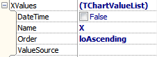

TAChart does not provide a TChartValueList property. Here is the reference what this class contains in TeeChart.
DateTime: tells TeeChart that data values are numbers (false) or date/time values (true). Not available in TAChart. Automatic presentatation of date/time values as axis labels can be achieved by assigning a TDateTimeIntervalChartSource to the axis; date/time series mark texts can be obtained by means of the OnGetMark event of the series.
Name: Name of the series, needed when series is used as ValueSource of another series. Not needed in TAChart.
Order = (loNone, loAscending, loDescending): Sorting order of the data. In TAChart, sorting is achieved by the chart source, in case of the TListChartSource commonly used for TLineSeries this is the property Sorted.
ValueSource: If series is connected to a database then this is the name of a dataset field. If series is connected to another chart, then this is the name of the connected chart. TAChart does support database-sensitive chartsources, but sharing data with other charts is possible only by linking their chart sources.
TSeriesMarks
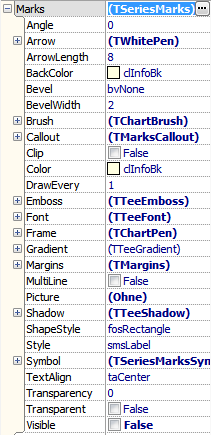

Angle: Rotation angle of marks, in degrees. In TAChart, use Marks.LabelFont.Orientation (which is in tenths of degrees).
Arrow: Parameters for the connecting line between mark and data point. Property name is misleading since an arrow head is not drawn by default (only after setting Callout.ArrowHead to a value different from ahNone). This property is called LinkPen, parameters for an arrow head are available under Arrow.
ArrowLength: Length of the connecting line between mark and data point. Use Distance in TAChart.
BackColor: Background color of the mark. In TAChart, use LabelBrush.Color.
Bevel, BevelWidth: Draws a bevel around the mark (like TPanel). Not available.
Brush: Parameters to draw the background of the mark. In TAChart, use LabelBrush which has less options, though.
CallOut: Parameters to refine the connection line between mark and data point; you can also set the arrow head here. In TAChart, callout-type of connection can be defined by CallOutAngle which is in tenths of degrees; the arrow head is set by property Arrow.
Clip: Clips mark labels at the edge of the chart areas. Called Clipped in TAChart.
Color: Seems to be the same as BackColor. LinkBrush.Color in TAChart.
DrawEvery: Integer: Allows to skip a number of marks to avoid overlap. Not available.
Emboss: Upward-directed shadow. Not supported.
Font: Font of the marks text. In TAChart LabelFont.
Frame: Parameters for drawing the frame around the mark. The same as with TAChart.
Gradient: See TTeeGradient. No gradient support in TAChart.
Margins: Distance between text and frame. The same as with TAChart.
MultiLine: Enable/disable multilined marks. Not available in TAChart, but works like true</true> if the mark format mask contains LineEnding.
Picture: No support for background picture in TAChart.
Shadow: No shadow support in TAChart.
ShapeStyle = (fosEllipse, fosRectangle, fosRoundRectangle): Like TAChart's Shape which has more options.
Style = (smsLabel, smsLabelPercent, smsLabelPercentTotal, smsLabelValue, smsLegend, smsPercent, smsPercentRelative, smsPercentTotal, smsPointIndex, smsSeriesTitle, smsValue, smsXValue, smsXY): Like TAChart's Style with slightly different options.
Symbol: Adds the series symbol to the mark. Not available.
TextAlign: Alignment of text within frame rectangle. Not available.
Transparency: Percentage of transparency to see the background underneath the marks. Not available.
Transparent: Toggles visual enhancements like frame, shadow, emboss. Not available.
Visible: Turns marks on/off. The same as in TAChart.
TSeriesPointer
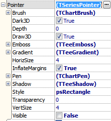

Brush: Parameters, how the interior of the symbol is filled. Like in TAChart.
Dark3D: Shades faces of the extruded shape (if Draw3D=true) as if it were illuminated by a light source. Not available.
Depth, Draw3D: In 3d view, allows to extrude symbols into depth (as specified by Depth); only available of Style = psRectangle. Not available in TAChart.
Emboss: Upward-directed shadow, not supported.
Gradient: See TTeeGradient. No gradient support in TAChart
HorizSize, VertSize: Size of the data symbol, like in TAChart.
InflateMargins: Automatically increases the extent of the chart such that the symbols at the edge are not clipped. Not available in TAChart, but can be achieved manually by increasing the chart's Margins.
Pen: Parameters used to draw the outline of the symbol. Like in TAChart.
Shadow: No shadow support in TAChart
Style = (psRectangle, psCircle, psTriangle, psDownTriangle, psCross, psDiagCross, psStar, psDiamond, psSmallDot, psNothing, psLeftTriangle, psRightTriangle, psHexagon): Geometrical shape used for the pointer symbol, like in TAChart with slightly different options.
Transparency: Percentage of transparency which allows to see the background underneath the symbols. Not supported, transparency of the entire series is controlled by the corresponding property of the series.
Visible: Shows/hides the point symbols. In TAChart, use the property ShowPoints of the series.
Events