TECTabCtrl
Overview
About
TECTabCtrl is part of Eye Candy Controls (shortly ECControls or EC-Controls), see http://wiki.freepascal.org/Eye-Candy_Controls, set of visual controls written for Lazarus. Its design is based on Themes, therefore its look is very native everywhere, no matter what widgetset you use.
Each release is announced on Lazarus Forum in section Third Party Announcements.
There are always attached files README.txt (list of all known issues) and CHANGELOG.txt (list of all changes from previous release).
License
GNU Lesser General Public License 2.0 with linking exception (a.k.a. Modified LGPL). File ectabctrl.pas contains license header. Also, files COPYING.modifiedLGPL.txt and COPYING.LGPL.txt are bundled to each archive.
Author
This component is written by Blaazen. Copyright notice and real name is mentioned in the header of the unit. You can contact author on Lazarus Forum (nickname: Blaazen) in any thread about EC-Controls. If you are logged in to forum, you can get author's e-mail or send him private message.
Download and Install
See http://wiki.freepascal.org/Eye-Candy_Controls#Install
Component
TECTabCtrl is installed to the tab EC-C on the Lazarus component palette.
This component is advanced alternative TTabControl. It allows tab stacking, tabs in multiple rows, top/bottom/left/right orientation, reversed and right-to-left bi-directional mode, dragging tabs to move or fold them and many others.
Mouse
Left-click on a tab activates it.
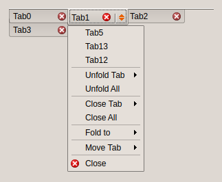
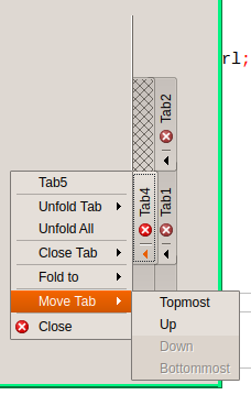
Left-click on arrow area or right-click anywhere on the tab opens drop-down menu.
Dragging
When etcoFoldingPriority is NOT set:
Dragging moves a tab.
Dragging + CTRL key folds a tab.
Setting etcoFoldingPriority causes opposite behaviour.
Notes:
- etcoFixedPosition: tabs cannot be moved
- etoCanBeFolded: tab can be folded into another tab
- etoCanFold: tab can fold another tabs
Keyboard
Arrow keys change tab (only when focused).
Enter or Space opens drop-down menu of selected tab (only when focused).
Acceleration keys (Alt + Key) change tab (doesn't need to be focused).
Code
Each tab has two identificators: Index and ID.
- ID is unique and never changes during the life of tab
- Index is unique but it changes as tabs are moved, folded, unfolded, added or deleted.
function IDToIndex(AID: Integer): Integer;
Returns index of tab AID.
procedure ActivateTab(AIndex: Integer);
Activates tab AIndex. If tab is folded, folder and folded tab are switched.
function AddTab(APosition: TECTabAdding; AActivate: Boolean): TECTab;
Adds a new tab. Must be specified where the tab will be positioned and whether it will be activated.
procedure CloseAllFoldedTabs(AFolder: Integer);
Closes all tabs folded to AFolder.
procedure DeleteTab(AIndex: Integer);
Deletes tab AIndex.
function FindFolderOfTab(AIndex: Integer): Integer;
Returns index of folder which contains tab AIndex. Result is -1 when tab is not folded anywhere.
procedure FoldTab(AIndex, AFolder: Integer);
Folds tab AIndex to folder AFolder.
function IndexOfTabAt(X, Y: Integer): Integer;
Returns index of tab at coordinates X, Y. Result is -1 when there is no tab at X, Y.
function IsTabVisible(AIndex: Integer): Boolean;
Returns True when tab AIndex is visible and is in visible area (i.e. is not scrolled out).
procedure MakeTabAvailable(AIndex: Integer; AActivate: Boolean);
Makes tab AIndex available, i.e. moves tab to visible area (if necessary), switches it with its folder (if necessary) and activates it if AActivate is True.
procedure MoveTab(AFrom, ATo: Integer);
Moves tab to a new position.
procedure UnfoldTab(AID: Integer; AFolder: Integer=-1);
Unfolds tab AID. If its folder is known, caller can specify it. Otherwise, method attempts to find folder itself.
Examples
Screenshots ar taken from Plasma5. Desktop theme for Examples 1-7 is Plastique, Example 8 is Breeze.
Example 1
Basic layout.
Example 2
Tabs are in one row, their size exceeds width of component. Left-right buttons and optional Add button appear.
Example 3
Tabs are in two rows, their size exceeds width of component. Left-right buttons and optional Add button appear.
Example 4
Component is in reversed mode. Tabs are in three rows, their size exceeds width of component. Left-right buttons and optional Add button appear. Note that buttons are aligned differently when component has one/two/three or more rows.
Example 5
Tab position is tpLeft. Tabs are in two rows. Close button on each tab is displayed.
Example 6
Tab position is tpBottom. Tabs are in two rows. Close button on each tab is displayed. Drop-down menu is opened (Tab5, Tab12 and Tab13 are folded to Tab1).
Example 7
Tab position is tpRight. Tabs are in two rows. Close button on each tab is displayed. Drop-down menu is opened (Tab5 is folded to Tab1).
Example 8
Tabs are in two rows. Close button tab is displayed on the active tab only. Tabs are enlarges so they fulfil the width of component. Desktop theme is Breeze.


