CalLite
│
English (en) │
suomi (fi) │
русский (ru) │
About
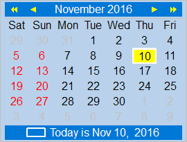
TCalendarLite is a light-weight calendar component, a TGraphicControl descendant which consequently is not dependent on any widgetset. It is not a fixed-size component, as are most calendars, but will align and resize as needed. A variety of property gives access to almost every aspect of its appearance.
Authors
Howard Page-Clark, Ariel Rodriguez and Werner Pamler
License
Modified LGPL (with linking exception, like Lazarus LCL)
Download and Installation
Release version
A zip file with the most recent release version can be found at Lazarus CCR at SourceForge. Unzip the file into any folder.
The current release version is 0.2
Development version
Use an svn client to download the current trunk version from svn://svn.code.sf.net/p/lazarus-ccr/svn/components/callite/
Installation
In Lazarus, go to "Package" > "Open Package File .lpk". Navigate to the folder with the callite sources, and select callight_pkg.lkp. Click "Compile", then "Use" > "Install". This will rebuild the IDE (it may take some time). When the process is finished the IDE will restart, and you'll find TCalendarLite in the component palette Misc.
Usage
Simply drop a TCalendarLite component on the form and get a functional month-calendar.
- Click on any date
- Use the arrow keys on the keyboard
- Click on the arrow keys above the calendar; the single arrow advances by one month, the double arrow advances by one year
- Click on the month name to open a popdown menu with month names, or click on the year number to open a popdown menu with the last and next ten years.
Changing colors
The property Colors of the calendar collects all settings affecting the colors used for the various items:
- ArrowBorderColor: the color of the border of the arrows above the calendar (default: clSilver)
- ArrowColor: the fill color of the arrows above the calendar (default: clSilver)
- BackgroundColor: the background color of the entire calendar (default: clWhite)
- BorderColor: the color of an optional border around the calenard (default: clSilver). Add
coShowBorderto the calendar'sOptionsto display the border. - DayLineColor: the color of an optional separating line between the top navigation pane and the calandar's day area (default: clSilver). Add
coDayLineto the calendar'sOptionsto display the line. - HolidayColor: the text color used to display holidays (default: clRed). Add an event handler to
OnGetHolidaysto define which days are holidays. - PastMonthColor: the text color used to display the days of the previous or next month (default: clSilver).
- SelectedDateColor: fill color of the currently selected day (default: clMoneyGreen)
- TextColor: text color used for paint the regular calendar days (default: clBlack)
- TodayFrameColor: color used to draw a rectangular line around the "today" cell (default: clLime)
- TopRowColor: background color used for the top navigation line (default: clHighlight)
- TopRowTextColor: text color used in the top navigation line (default: clHighlightText)
- WeekendColor: text color used for painting weekend days (default: clRed)
