TAChart Tutorial: Dual y axis, Legend
Introduction
When different quantities are plotted into the same chart it happens quite often that they cover a largely different range. In an "ordinary" chart, the series with the large values dominates over the series with the small values which is compressed to a flat line. The chart would be much more meaningful if different axes could be used, one for the large values, and one for the small values.
When you worked through the tutorial on user-defined chartsource you will have come across such a case. In that tutorial we created a diagram of the world population as a function of age. There was also an option to draw the ratio of male-to-female population. This latter number is considerably smaller than the population count. So, if both data were combined in the same chart, the population ratio would shrink to a horizontal line.
This is the background for today's project. We will go to the population data again and draw population count and the male-to-female ratio in the same chart.
You will learn how to
- create a chart with two y axes
- work with auto-scale axis transforms
- use user-defined axis labels
- tweak the legend using less-known properties.
This is our "disclaimer", as usual: You should be familiar with Lazarus and FPC, and you should have a basic understanding of the TAChart library (go through Getting Started tutorial, if you don't). In this particular tutorial, it would also be helpful if you have studied the tutorial on user-defined chartsource.
Data
As already mentioned we will be using the same data as in the user-defined chartsource tutorial. The primary data file is called "population.txt" and orginates from http://www.census.gov www.census.gov. Unit population.pas reads this file and stores the data in an array PopulationData of TPopulationRecords:
type
  TPopulationRecord = record
    Age: Integer;
    Total: Double;
    Male: Double;
    Female: Double;
    Ratio: Double;
  end;

  TPopulationArray = array of TPopulationRecord;
Preparation
Now, we have all that we need to start a new project. Add the unit population.pas to the form's uses list. Add a variable PopulationData of type TPopulationRecord to the private section of the form. And read the data file by calling the procedure LoadPopulationData (in the population unit) from the form's OnCreate event handler:
uses
  ..., population;

type
  TForm1 = class(TForm)
  // ...
  private
    PopulationData : TPopulationArray;
  // ...
  end;

const
  POPULATION_FILE = 'population.txt';

procedure TForm1.FormCreate(Sender: TObject);
begin
  LoadPopulationData(POPULATION_FILE, PopulationData);
end;
Now be can begin charting...
Add a TChart component to the form:
- Align it as
alClient. - Set its
BackColortoclWhite. - Use the text "World population" as the chart's title.
- Mention our reference for the data in the footer - we don't want to steel data...
Add three line series to the chart:
- To be more descriptive, change their names to
LineSeries_male,LineSeries_female, andLineSeries_ratio. - Set the
SeriesColorof the male series to a "boyish"clSkyBlue, that of the female series to a "girlish"$00FF80FF, and leave the color of the ratio series at black.
Where do the series get their data from? Our data are stored in the PopulationData array, so it would be best to used a user-defined chart source. To be exact: we need three chart sources, one for each series.
Therefore, let's add three TUserDefinedChartSources to the form:
- Rename them as
ChartSource_male,ChartSource_female, andChartSource_ratio. - Assign each chartsource to the property
Sourcof the corresponding line series. - Write the following event handler and assign it to the OnGetDataItem event of each user-defined chart source:
procedure TForm1.ChartSourceGetChartDataItem(
  ASource: TUserDefinedChartSource; AIndex: Integer; var AItem: TChartDataItem);
begin
  AItem.X := PopulationData[AIndex].Age;
  if ASource = ChartSource_male then
    AItem.Y := PopulationData[AIndex].Male / 1e6
  else if ASource = ChartSource_female then
    AItem.Y := PopulationData[AIndex].Female / 1e6
  else
    AItem.Y := PopulationData[AIndex].Ratio / 100;
end;
Here we tell the chart source where it finds the data: the x value is taken from the Age field of the TPopulationRecord, and, depending on which ChartSource is using it, the y value is take from the Male, Female or Ratio fields of the TPopulationRecord.
We divide the population count by 1 million to get rid of the many zeros on the axis. So, don't forget, the population axis is labelled in terms of millions. We will come back to that later. We also divide the male-to-female ratio, as read from the file, by 100 since we just want fractions, no percentages.
Time to compile? No, not yet. We have to tell the ChartSources how many data it has to deal with. This information is known after reading the data file. Therefore, we set the property PointNumber of the ChartSource to the length of the data array in the form's OnCreate event handler:
procedure TForm1.FormCreate(Sender: TObject);
begin
  LoadPopulationData(POPULATION_FILE, PopulationData);
  ChartSource_male.PointsNumber := Length(PopulationData);
  ChartSource_female.PointsNumber := Length(PopulationData);
  ChartSource_ratio.PointsNumber := Length(PopulationData);
end;
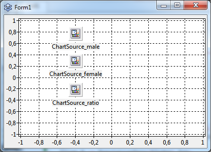
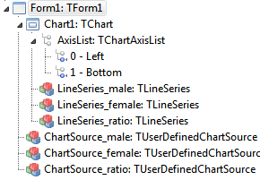
At this stage, your form and object tree should look like this:


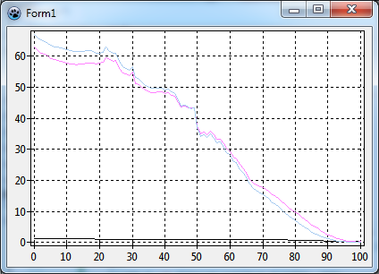
and when you compile you should see something like this:

As mentioned in the introduction, the male-to-female ratio -- that is the black line -- is very flat and shows almost no structure. This is due to the different magnitudes: the population count goes almost up to 100 (millions) while the ratio is around 1.
Setting up a second y axis
We need a second y axis.
For this, go to the object tree, right-click on AxisList (right underneath the Chart1 and add a new axis to the chart. Now we have three axes:
Select the axis #2 which is still a left axis at this time, and in the object inspector, set its Alignment to calRight.
How does the chart know which series belongs to which axis? For this purpose, each series has properties AxisIndexX and AxisIndexY. Since the male and female series will be plotted on the left axis set their AxisIndexY to 0 -- this is the index of the left axis. The ratio series belongs to the right axis, its AxisIndexY must be set to 2. We could also set the axis indices of the bottom axis, but this is not absolutely necessary.
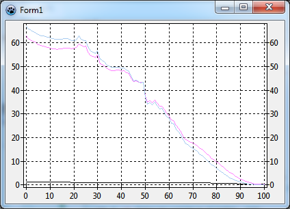
When we compile the result is a bit disappointing: no change - the black "ratio" series is still very small.

