Difference between revisions of "TAChart Tutorial: ColorMapSeries, Zooming"
m (→Preparation) |
|||
| Line 18: | Line 18: | ||
Ready to start? | Ready to start? | ||
| − | Create a new project, and add a client-aligned TChart component. Double-click on the chart to open the series editor and add a "Color map series" to the chart. Next, drop a <code>TListChartSource</code> to the form. This will be the <code>ColorSource</code> for the ColorMapSeries. So, name it ''"ColorSource"'' and assign it to the <code>ColorSource</code> property of the series. | + | Create a new project, and add a client-aligned TChart component. Don't make the form too large because this tutorial project will require a LOT of computation, and too many pixels will kill performance... |
| + | |||
| + | Double-click on the chart to open the series editor and add a ''"Color map series"'' to the chart. Next, drop a <code>TListChartSource</code> to the form. This will be the <code>ColorSource</code> for the ColorMapSeries. So, name it ''"ColorSource"'' and assign it to the <code>ColorSource</code> property of the series. | ||
[[file:Madelbrot_ColorMapSeries.png]] | [[file:Madelbrot_ColorMapSeries.png]] | ||
Revision as of 22:58, 14 October 2012
Introduction
The "Mandelbrot set", named after Benoit Mandelbrot, is a so-called "fractal" -- a two-dimensional shape that is famous for its self-similarity at various scales. Magnifying a fractal reveals small-scale details similar to the large-scale characteristics.
In this tutorial, we will use TAChart to draw the Mandelbrot set by means of a colormap series and practice a variety of zooming techniques, like using the zoom drag tool, or setting up an extent history.
As usual, we require a basic knowledge of working with TAChart which you can aquire by going through the "Getting Started" tutorial. And, of course, you must be familiar with the Lazarus IDE and the Object Pascal language.
Using TColormapSeries
What is a TColorMapSeries?
The series that you typically work with are for two-dimensional data -- there is one axis for the x coordinates, and another one for the y values which are assigned to the x values. TColorMapSeries is one exception: it displays three-dimensional data: we have a point in the xy plane and assign to it a third value as its height above the xy plane. Often, 3D plots, are considered to be like a mountain landscape above a base plane. Unfortunately, TAChart cannot draw 3d projections. But there is an alternative: the height above the base plane can be can be mapped to a color, this means the chart fills the xy plane with colors which correspnd to the value of the third coordinate.
TColorMapSeries is a functional series, this means that it cannot plot arbitrary data, but only data that can be calculated from a function. For this purpose, the series exposes an event OnCalculate which is called for every (x,y) point to pass the function value. In this sense, the TColorMapSeries is similar to the TFuncSeries which we meet in another tutorial.
The second basic ingredient is a ColorSource which maps the function values to a color. It is convenient to use a TListChartSource for this purpose. In general, it stores x and y values along with a color value and a descriptive label in TChartDataItems, but for the mapping purpose we need only the x and color entries.
Preparation
Ready to start?
Create a new project, and add a client-aligned TChart component. Don't make the form too large because this tutorial project will require a LOT of computation, and too many pixels will kill performance...
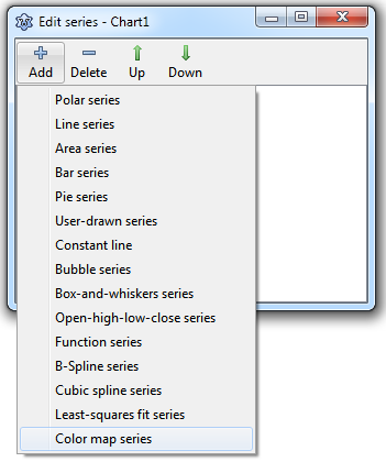
Double-click on the chart to open the series editor and add a "Color map series" to the chart. Next, drop a TListChartSource to the form. This will be the ColorSource for the ColorMapSeries. So, name it "ColorSource" and assign it to the ColorSource property of the series.
Setting up the color map
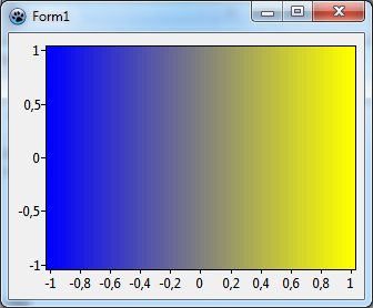
To get some familiarity in this new terrain, let us begin with a simple example: we use the ColorMapSeries to draw a gradient along the x axis.
At first, we write an event handler for the ColorMapSeries' OnCalculate. This is easy since we want only a simple linear gradient:
procedure TForm1.Chart1ColorMapSeries1Calculate(const AX, AY: Double;
  out AZ: Double);
var
  ext: TDoubleRect;
begin
  ext := Chart1.GetFullExtent;
  AZ := (AX - ext.a.x) /(ext.b.x - ext.a.x);
end;
To be independent of the size of the chart we normalize the x coordinate by the range of x data (in graph units). The x range can be calculated from the FullExtent of the chart -- this is a rectangle of double-precision values defined by the corner points of the chart's plotting rectangle before any zooming or panning is applied. The normalization as shown above makes sure that AZ is 0 at the left end, and 1 at the right end of the x axis.
Finally we have to populate the ColorSource to setup the gradient. This is very easy since the ColorMapSeries does all the interpolations if its property Interpolate is set to true.
To define the gradient we begin with the value 0.0 and assign it to the color blue. The end of the gradient corresponds to the value 1.0 and it should appear in red. We make these assignments in a procedure PopulateColorSource that we call from the OnCreate event handler of the form; we use a separate procedure since we'll do some modifications throughout this tutorial and want to keep things separate.
procedure TForm1.FormCreate(Sender: TObject);
begin
  PopulateColorSource;
end;

procedure TForm1.PopulateColorSource;
const
  DUMMY = 0.0;
begin
  with ColorSource do begin
    Add(0.0, DUMMY, '', clBlue);      // 0.0 --> blue
    Add(1.0, DUMMY, '', clYellow);    // 1.0 --> yellow
  end;
end;
Due to the syntax of TListChartSource.Add we also have to enter values for the y coordinate and the marks text, we use the constant ycode>DUMMY and an empty string since we don't need them.
Let's run the program. If you don't see a gradient you may have forgotten to activate the Interpolate setting of the ColorMapSource. If you look carefully you will see some narrow banding of the color shades particularly in the center transition region. This is due to the StepX and StepY properties of the ColorMapSource which are still at their default value of 4. This means that the xy plane is not scanned pixel by pixel, but in blocks of 4x4 pixels, to speed up drawing. Set these values to 1 to get rid of the banding. The improved resolution is also advantageous for the Mandelbrot set later. However, it will slow down program execution which may be quite dramatic if you have a slow computer...
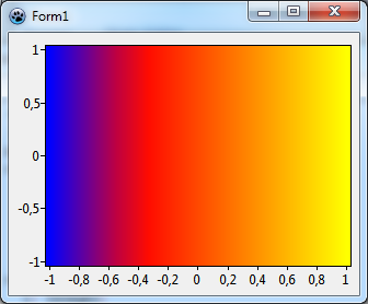
Let's go a step further and add another pivot to our gradient. What about red in the middle corresponding to, say, 0.3? Just put another call to Add into the PopulateColorSource procedure. Since the interpolation requires a sorted list you should add the new color between the other ones, or you should call Sort after adding color-value pairs. The result of this tree-color gradient is shown above, we will used it now when we draw the Mandelbrot set.
procedure TForm1.PopulateColorSource;
const
  DUMMY = 0.0;
begin
  with ColorSource do begin
    Add(0.0, DUMMY, '', clBlue);      // 0.0 --> blue
    Add(0.3, DUMMY, '', clRed);       // 0.3 --> red
    Add(1.0, DUMMY, '', clYellow);    // 1.0 --> yellow
  end;
end;
At first, we have to define the range of the x and y data. As we will see later, an overview of Mandelbrot set is seen best when x amd y range between -2.2 and 0.8, and between -1.5 and 1.5, respectively. Enter these numbers in the chart's Extent fields XMin, XMax, YMin and YMax, and set the fields UseXMin, UseXMax, UseYMin and UseYMin to true to activate these values as axis limits.
Although the Mandelbrot set is self-similar at magnified scales, the small scale details are not identical to the whole. In fact, the Mandelbrot set is infinitely complex. Yet the process of generating it is based on an extremely simple equation involving complex numbers.
At first, we have to define the range of the x and y data. As we will see later, an overview of Mandelbrot set is seen best when x amd y range between -2.2 and 0.8, and between -1.5 and 1.5, respectively. Enter these numbers in the chart's Extent fields XMin, XMax, YMin and YMax, and set the fields UseXMin, UseXMax, UseYMin and UseYMin to true to activate these values as axis limits.
Calculation of the Mandelbrot set
The Mandelbrot set is calculated for each 2d point c = (c.x, c.y) by applying the following recipe:
- Begin by assigning the coordinates of c to another point z = (z.x, z.y) = (c.x, c.y).
- Calculate the "square" of z by means of the following formula: z² = ((z.x)²-(z.y)², 2*(z.x)*(z.y)) (this formula may appear to be a bit strange, but if you are familiar with complex numbers then you will see that it is the square of a complex number). Then add the coordinates of c to those of
z². The result of this step is z² + c - Now take that result and put it into the calculation in step 2 again.
- Repeat this procedure again and again until you can distinguish whether the trace of the movement of the point z in the 2d plane diverges into infinity or not.
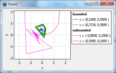
In the figure we show some examples of that trace:
- The red and fuchsia curves eventually move away from the origin, these paths are "unbounded". It can be shown that once the path has crossed a critical distance of 2 from the origin it will never turn back and will escape into infinity. Usually the calculation counts the iterations until the distance from the origin exceeds 2. The number of iterations is mapped to a color which is used to draw the pixel at the starting point.
- The blue path, on the other hand, converges towards the origin. The green curve does not converge, but remains within the escape radius. Therefore, both cases are called "bounded". The iterative calculation would go on forever, therefore it is stopped after a maximum count of iterations. The starting points are said to belong to the Mandelbrot set and are drawn in black color.
Here is the function that we will use to determine whether a point c is in the Mandelbrot set or not. The function result is the iteration count divided by the maximum iteration count. The result 1.0 indicates that c belongs to the Mandelbrot set.
const
  MANDELBROT_NUM_ITERATIONS = 100;
  MANDELBROT_ESCAPE_RADIUS = 2.0;
  MANDELBROT_LIMIT = sqr(MANDELBROT_ESCAPE_RADIUS);

function MandelBrot(c:TDoublePoint): Integer;
var
  iteration: Integer;
  j: Integer;
  z: TDoublePoint;
begin
  Iteration := 0;
  z := DoublePoint(0.0, 0.0);
  for j:=0 to MANDELBROT_NUM_ITERATIONS-1 do begin
    z := DoublePoint(
      sqr(z.X) - sqr(z.Y) + c.X,
      2 * z.X * z.Y + c.Y
    );
    if sqr(z.X) + sqr(z.Y) > MANDELBROT_LIMIT then begin
      Result := Iteration / MANDELBROT_NUM_ITERATIONS;
      exit;
    end;
    inc(Iteration);
  end;
  Result := 1.0;
end;
We will also need a function which maps the result of the Mandelbrot function to a color. A nice color gradient can be obtained by the following procedure which is an interpolation of rgb values applied to two intervals. The input parameter AValue must be number between 0 and 1. (The function InterpolateRGB belongs to the TAChart package and is found in the unit TAChartUtils):
const
  STARTCOLOR = clBlue;
  MIDDLECOLOR = clRed;
  ENDCOLOR = clYellow;
  MIDDLEVALUE = 0.3;

function ValueToColor(AValue: Double; AMiddleValue: Double;
  AStartColor, AMiddleColor, AEndColor: TColor): TColor;
begin
  if AValue < AMiddleValue then
    Result := InterpolateRGB(AStartColor, AMiddleColor,
      AValue/AMiddleValue)
  else
    Result := InterpolateRGB(AMiddleColor, AEndColor,
      (AValue - AMiddleValue) / (1.0 - AMiddleValue)
    );
end;


