Difference between revisions of "Turbopower Visual PlanIt"
(→Using the navigation bar: Beginning to add docs for TVpNavBar) |
(→Using the navigation bar: Initial commit of TVpNavBar.) |
||
| Line 64: | Line 64: | ||
== Using the navigation bar == | == Using the navigation bar == | ||
[[Image:vpnavbar.png]] | [[Image:vpnavbar.png]] | ||
| + | |||
| + | <tt>TVpNavBar</tt>, seen in the left of this screenshot of the ''navbar'' demo, is a navigation tool smiliar to the one known from Outlook. It consists of several '''folders''' represented by button-like controls and several '''items''' - these are the labelled icons in the large space between two buttons. The folder button - which can be drawn in several button- or tab-like styles - is always shown above the associated icons. Clicking on a folder divides the stack of folders in an upper and lower part, and displays the items assigned to this folder between the corresponding folder at the top and the next folder at the bottom. The index of the currently expanded folder is given by the property <tt>ActiveFolder</tt>, and the index of the clicked items within this folder is given by property <tt>ActiveItem</tt>. An event <tt>OnItemClick</tt> fires when an item is clicked, it has the index of the clicked item as a parameter. | ||
| + | |||
| + | '''Populating a TNavBar at designtime''' is a bit complicated. In the original version of VisualPlainIt there exists a component editor, but this does not work and was not ported/adapted to Lazarus so far. Therefore, it is best to learn this task by means of the object inspector: | ||
| + | |||
| + | * Add a TVpNavBar component to the form. | ||
| + | * Click on the "..." button next to <tt>FolderCollection</tt> to open the collection editor for the folders. | ||
| + | * Click "Add" to add a new folder. | ||
| + | * Select the new folder in the collection editor, its properties appear in the object inspector. | ||
| + | * Specify the <tt>Caption</tt> of the folder - this is the text to appear on the button/tab assigned to the folder. | ||
| + | * <tt>IconSize = isLarge</tt> will use 32x32 icons for the folder's items which will be centered and have the (word-wrapped) caption underneath. <tt>isSmall</tt>, on the other hand, uses 16x16 icons, leftaligned, and the (non-wrapped) text follows at the right of the icon. <tt>IconSize</tt> can change from folder to folder. | ||
| + | * Do no set the <tt>FolderType</tt> to <tt>ftContainer</tt> - this feature of adding other controls to the folder is not working at the time of this writing in Lazarus. | ||
| + | * In order to add icons to the folder click on <tt>ItemCollection</tt>. This opens the collection editor fot the items belonging to the current folder. | ||
| + | * Again click "Add" to add a new item, and select the new item in the collection editor to show its properties in the object inspector. | ||
| + | * <tt>Caption</tt> is the text assigned to the item. | ||
| + | * <tt>IconIndex</tt> refers to the icon to be drawn for this item. It is the index in the ImageList assigned to the NavBar's <tt>Images</tt>. The image list should contain 32x32 images for the folder's large <tt>IconSize</tt> mentioned above. ideally there should be a second image list with 16x16 images. Image lists can be exchanged in the event handlers for the <tt>OnFolderChanged</tt> events of the <tt>NavBar</tt>. If a small imagelist does not exist the images of the large imagelist are scaled down to 16x16 pixels automatically. | ||
== Gadgets == | == Gadgets == | ||
Revision as of 18:10, 31 July 2016
│
English (en) │
português (pt) │
русский (ru) │
About
Visual PlanIt is a set of synchronized, data-aware components for adding time, task, & contact management capabilities to applications. Get that Outlook look & feel without the hassle.
This component was designed for cross-platform applications.
Screenshot
Author
Author: Turbo Power Software
LCL Port: Christian Ulrich and Werner Pamler
License
Download
not at time
SVN
You can checkout the actual source from
https://lazarus-ccr.svn.sourceforge.net/svnroot/lazarus-ccr/components/tvplanit
The commandline to do this is
svn co https://lazarus-ccr.svn.sourceforge.net/svnroot/lazarus-ccr/components/tvplanit
Bug reporting / Feature request
Bug reports and feature requests should be sent to the Lazarus/Free Pascal Bug Tracker; please specify the "Lazarus-CCR" project: http://bugs.freepascal.org/
Change Log
- Feb 02, 2008 - Initial port (version 1.03)
- Aug 01, 2016 - (Almost) complete port (version 1.04)
Dependencies / System Requirements
- FPC 2.6.4 or newer
- Lazarus 1.4.4 or newer
- These versions were available at the time of writing this update. It is not exluced that the package can be used with older versions as well.
Installation
- Create a directory for the components, such as lazarus\components\tvplanit
- In this directory, unzip the files from the zip file, or execute the svn commandline from above.
- Open lazarus
- Open the package laz_visualplanit.lpk from the source folder with Component/Open package file (.lpk).
- (Click on Compile only if you don't want to install the component into the IDE)
- Click on Install
- If you need the Zeos datastore repeat with package laz_visualplanit_zeos.lpk from folder source/addons/zeos. Make sure that the Zeos components are installed.
Getting started
Here is a quick tutoral for your first steps with the VisualPlanIt components.
Using the planner components
Events
Tasks
Contacts
Printing and print preview
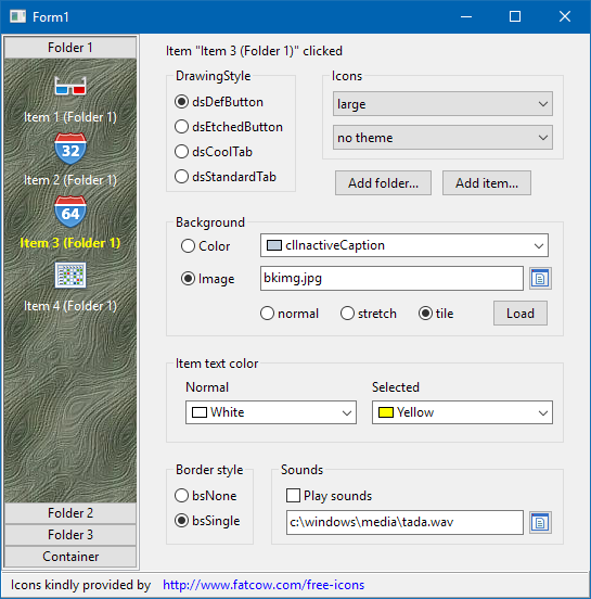
TVpNavBar, seen in the left of this screenshot of the navbar demo, is a navigation tool smiliar to the one known from Outlook. It consists of several folders represented by button-like controls and several items - these are the labelled icons in the large space between two buttons. The folder button - which can be drawn in several button- or tab-like styles - is always shown above the associated icons. Clicking on a folder divides the stack of folders in an upper and lower part, and displays the items assigned to this folder between the corresponding folder at the top and the next folder at the bottom. The index of the currently expanded folder is given by the property ActiveFolder, and the index of the clicked items within this folder is given by property ActiveItem. An event OnItemClick fires when an item is clicked, it has the index of the clicked item as a parameter.
Populating a TNavBar at designtime is a bit complicated. In the original version of VisualPlainIt there exists a component editor, but this does not work and was not ported/adapted to Lazarus so far. Therefore, it is best to learn this task by means of the object inspector:
- Add a TVpNavBar component to the form.
- Click on the "..." button next to FolderCollection to open the collection editor for the folders.
- Click "Add" to add a new folder.
- Select the new folder in the collection editor, its properties appear in the object inspector.
- Specify the Caption of the folder - this is the text to appear on the button/tab assigned to the folder.
- IconSize = isLarge will use 32x32 icons for the folder's items which will be centered and have the (word-wrapped) caption underneath. isSmall, on the other hand, uses 16x16 icons, leftaligned, and the (non-wrapped) text follows at the right of the icon. IconSize can change from folder to folder.
- Do no set the FolderType to ftContainer - this feature of adding other controls to the folder is not working at the time of this writing in Lazarus.
- In order to add icons to the folder click on ItemCollection. This opens the collection editor fot the items belonging to the current folder.
- Again click "Add" to add a new item, and select the new item in the collection editor to show its properties in the object inspector.
- Caption is the text assigned to the item.
- IconIndex refers to the icon to be drawn for this item. It is the index in the ImageList assigned to the NavBar's Images. The image list should contain 32x32 images for the folder's large IconSize mentioned above. ideally there should be a second image list with 16x16 images. Image lists can be exchanged in the event handlers for the OnFolderChanged events of the NavBar. If a small imagelist does not exist the images of the large imagelist are scaled down to 16x16 pixels automatically.
Gadgets
In addition to the planner components the Visual PlanIt package contains also two stand-alone gadgets:
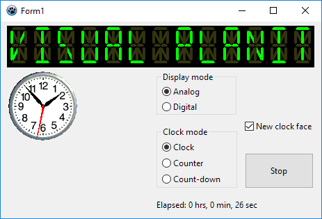
TVpLEDLabel
This is a 14-segment LED display which can display any ASCII string. The string is defined by means of the property Caption, but the count of LED characters must be defined explicitly using the property Columns
TVpClock
This is a digital or analog clock - depending on the property DisplayMode. A variety of settings can be adjusted for each mode separately by using the properties in AnalogOptions and DigitalOptions. The properties are pretty much self-explanatory, except maybe the DigitalOptions.MilitaryTime which activates the 24-hour display if true, or the 12-hour am/pm mode if false. The AnalogOptions.ClockFace replaces the default-drawn clock face by a bitmap - see screenshot above.
With the property ClockMode the operation of the clock can be changed from standard clock (count-up or count-down timer, cmClock, cmTimer, cmCountdownTimer, respectively).


