macOS Big Sur changes for developers
This article applies to macOS only.
See also: Multiplatform Programming Guide
User interface changes
macOS 11 Big Sur introduces many user interface changes that update the appearance of applications and make them more iOS-like. It also adds support for familiar iOS features — such as SF Symbols and text styles.
Icons and Images
macOS 11 refreshes icon design throughout the system and also introduces multipurpose feature icons that can represent items or functions in sidebars and tables. It also adopts iOS SF Symbols. macOS 11 automatically maps AppKit shared images — such as Action, Unlocked, and Share — to specific symbols. In some cases, a symbol might not have the same size or alignment as the AppKit image it replaces, so check your layout.
Application icons
In macOS 11, application icons combine a rounded-rectangle shape, a front-facing perspective, and a consistent drop shadow.
The new design does not preclude judicious expressiveness. For example, the Preview, Xcode, and TextEdit icons continue to combine depictions of the physical objects that best convey the applicationʼs core purpose, while incorporating the new shape, perspective, and shadow.
Document Icons
To compose a document icon, the system combines your application icon with the familiar folded-corner icon shape. If your application opens or creates a large number of document types, you can also supply a custom centre image or background appearance to help people distinguish them.
Feature Icons
A feature icon can represent an item (or category of items), a technology, or a type of information in a table view or in the content sidebar of a preferences window. A feature icon typically uses the macOS 11 rounded rectangle shape to contain a simple, unambiguous glyph, but it can also use custom shapes and colors. For help designing a feature icon, download the production template included in the Apple Design Resources for macOS.
| macOS 11 | macOS 10.15 |
App Accent Colours
In macOS 11, you can specify an accent colour to customize the appearance of your applicationʼs buttons, selection highlighting, and sidebar glyphs. The system applies your accent colour when the current value in the user's General > Accent colour preferences is multicolour.
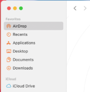
If users set the Accent colour preferences to a value other than multicolour, the system applies their chosen colour to the relevant items throughout your application, replacing your accent colour. The exception is a sidebar glyph that uses a fixed colour you specify. Because a fixed-colour sidebar glyph uses a specific colour to provide meaning, the system does not override its colour when users change the value of Accent colour preferences. To learn more, see Sidebars.
The iCloud glyph remains teal, even when the other glyphs use orange.
Windows and Views
Throughout macOS 11, windows adopt visual touches that recall iOS interfaces. For example, windows integrate the sidebar, toolbar, and content areas, use an increased corner radius, and display lightweight controls.
Toolbars and Title Bars
By default, toolbars are taller, window titles can display inline with controls, and toolbar items no longer include a bezel. The increased height and bezel-free controls combine to give macOS 11 toolbars a streamlined appearance.


